Debugging Matplotlib (Part 6)
Posted by Mark on May 19, 2022 at 06:28 | Last modified: March 23, 2022 11:06I left off with a seemingly counterintuitive situation where plt.xticks() either effects something yet to be generated or gets undone by something later in the program. After completing that last post, though, I had a shocking realization: I THINK I KNOW THE ANSWER AS A RESULT OF MATPLOTLIB EXCEPTIONS HAVING BEEN RAISED IN MY PAST WORK!
Exceptions are usually frustrating because they force me to problem solve something I inadvertently did wrong. Now, that past frustration proves quite beneficial in leaving the indelible image in my mind of a completely blank graph.
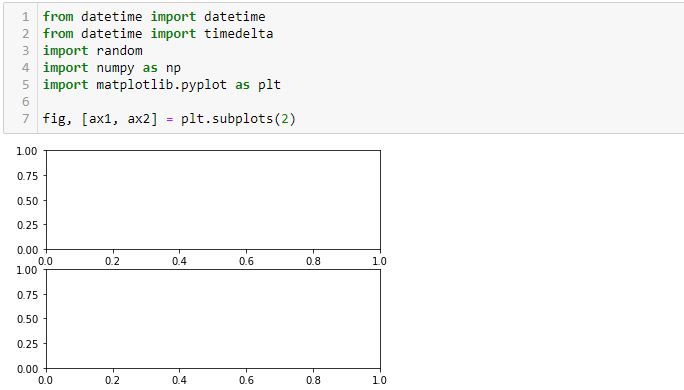
Let me simply the code to include only the imported modules and the first graphing line:
I completely erred in my reasoning throughout the last four paragraphs of Part 5. Neither L3 nor L6 draws any axes. All axes are generated in L1 and this includes the “last [second set of] axes.” L4 and L7 both operate on the second set of axes defined in L1, which is why only the x-axis labels of the lower graph were rotated.
This makes more sense. There is no retroactive operation and no need to hold a command in memory for something not yet generated—both of which seem very “unpythonic.”
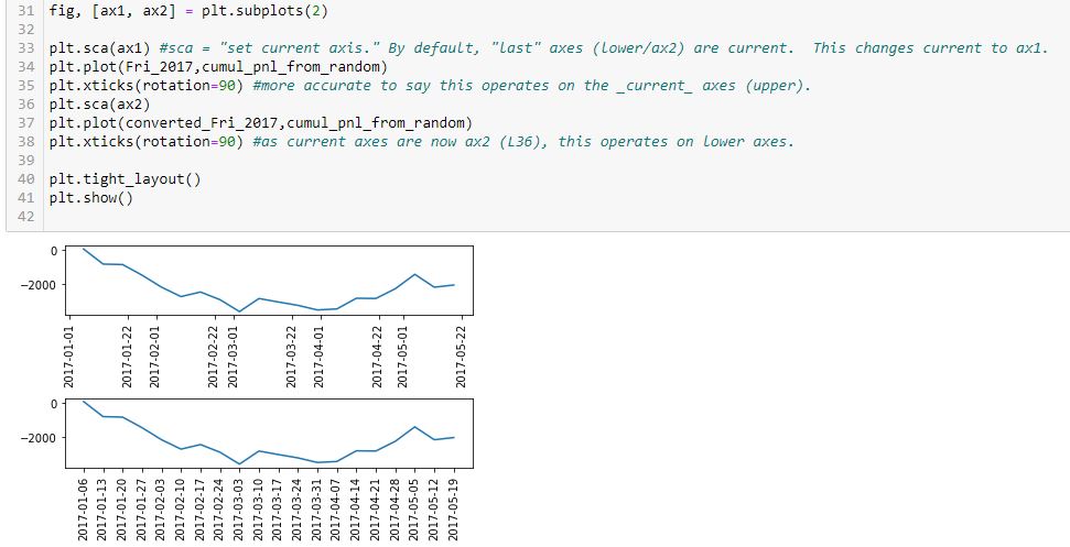
Having said all that, experiencing a natural high, and catching my breath, this snippet produces the desired outcome:
Technically correct is to say current axes are those drawn last by default. Current axes may be explicitly set as shown here. This is how to vary the target of plt.xticks() to get x-axis labels rotated on both graphs.
Now…
Why is the spacing of x-axis labels different on these two graphs?
I will address that next time.
Categories: Python | Comments (0) | PermalinkDebugging Matplotlib (Part 5)
Posted by Mark on May 16, 2022 at 07:27 | Last modified: March 22, 2022 16:42Last time, I laid out some objectives to more simply re-create the first graph shown here. I will continue that today.
Objectives #2-3 are pretty straightforward:
In L2, the arguments for random.randint() are inclusive. You can see a -1000 as part of the first list at the bottom.
Also, note the second line of output is also a list. np.cumsum() generates an array, but the list constructor (in L4) converts this accordingly. Using np.cumsum() does this in one line as opposed to a multi-line loop, which could be used to iterate over each element of the first list subsequently adding to the last item of an incrementally-growing cumulative sum list.
Not seen are a couple additional modules I need in order to use these two methods:
> import random
> import numpy as np
I am going to skip ahead to objective #5 for the time being: the graph. Here is my first [flawed] attempt:
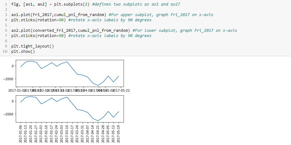
As you can see, the x-axis labels are rotated in the lower subplot but not rotated [and thereby rendered illegible] in the upper. Why do L4 and L7 not accomplish this for both subplots, respectively?
After googling this question a few different ways and looking through at least 20 different posts, the best response I found is this one from Stack Overflow: [no matter where the line appears in the code] “plt manipulates the last axis used.” Here, the last subplot is rotated but the first is not. What confuses me here is where plt.xticks() appears. In order to get the output seen, does the first subplot get rotated by L4 only to be unrotated with generation of the subsequent [last] axis at L6? Does L7 then rotate the x-axis labels on the subsequent [last, or lower] subplot?
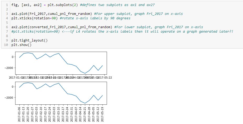
I find it extremely counterintuitive for a later line in the program to undo an earlier one because the earlier graph has already been drawn. I can test whether L7 actually rotates the x-axis labels in the lower subplot by commenting it out:
Indeed, this output is the same as the previous, which suggests a later line does not undo an earlier one. Rather, the earlier line effects a graph drawn later.
How does that work, exactly?
Categories: Python | Comments (0) | PermalinkDebugging Matplotlib (Part 4)
Posted by Mark on May 13, 2022 at 07:24 | Last modified: March 22, 2022 10:27Last time, I resolved a couple complications with regard to the x-axis. Today I want to tackle the issue of plotting a marker at select points only as shown in the first graph here.
Here is a complete account of what I have in that graph:
- Cumulative PnL on the y-axis that is available every week
- Datetime x-axis
- Markers on the line plot on where new trades begin
I cobbled together some solutions from the internet in order to make this work. I finally realized it’s not about plotting the line and then figuring out how to erase certain markers or plotting just the markers and figuring out how to connect them with a line. Rather, I must plot the line without markers first, and then plot all points (with marker or null) on the same set of axes:
> axs[0].plot(btstats[‘Date’],btstats[‘Cum.PnL’],marker=’ ‘,color=’black’,linestyle=’solid’) #plots line only
> for xp, yp, m in zip(btstats[‘Date’].tolist(), btstats[‘Cum.PnL’].tolist(), marker_list):
> axs[0].plot(xp,yp,m,color=’orange’,markersize=12) #plots markers only (or lack thereof)
This took days for me to figure out and required a paradigm shift in the process.
Does it really needs to be that complicated? I am going to re-create the graph with a simpler example in order to find out.
Here’s a rough list of objectives for coming up with data to plot:
- Generate a list 2017_Fri 20 consecutive Fridays starting Jan 1, 2017.
- Generate random_pnl_list of 20 simulated trade results from -1000 to +1000.
- Generate cumul_pnl_from_random, which will be a list of cumulative PnL based on random_list.
- Randomly determine trade_entries: five Fridays from _2017_Fri.
- Plot cumul_pnl line.
- Plot markers at trade_entries.
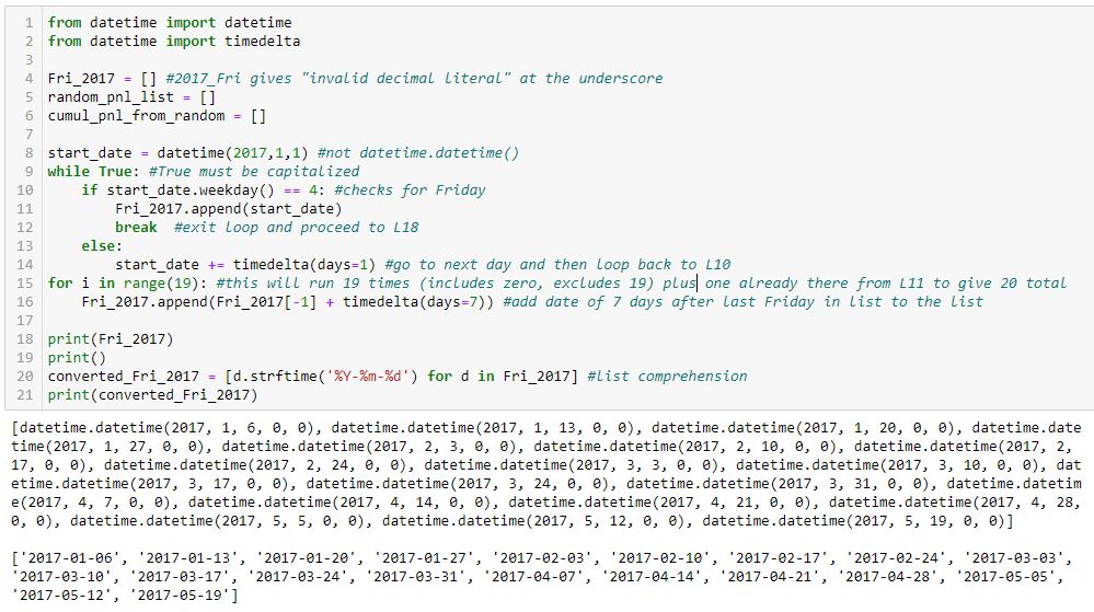
This accomplishes objective #1:
I tried to comment extensively in order to explain how this works.
Two lists of dates are shown in the output at the bottom. The first list is type datetime.datetime, which is a mess. The second list is cleaned up (type string) with L20.
I will continue next time.
Categories: Python | Comments (0) | PermalinkDebugging Matplotlib (Part 3)
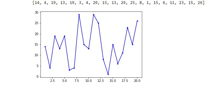
Posted by Mark on May 10, 2022 at 07:07 | Last modified: March 16, 2022 14:44Today I resume trying to fix the x-values and x-axis labels from the bottom graph shown here.
As suggested, I need to create a list of x-values. Even better than a loop with .append() is this direct route:
> randomlist_x = list(range(1, len(randomlist + 1))
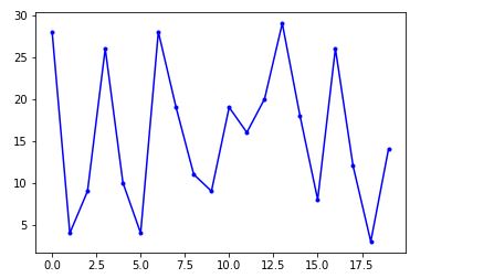
This creates a range object beginning with 1 and ending with the length of randomlist + 1 to correct for zero-indexing. The list constructor converts that to a list. Now, I can redo the graph:
> fig, ax = plt.subplots(1)
>
> ax.plot(randomlist_x, randomlist, marker=’.’, color=’b’) #plot, not plt
> plt.show()
The one thing I can see is decimals in the x-axis labels, which is not acceptable. Beyond that, I don’t have much clarity on the graph so I will add the following to show grid lines:
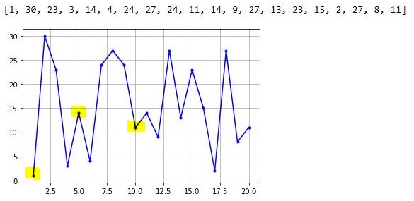
> plt.grid()
I can now clearly see the middle highlighted dot has an x-value of 5. Counting up to x = 10 for the right highlighted dot, I have confirmation that each dot has an x-increment of 1. The highlighted dot on the left is therefore at x = 1. I have therefore accomplished my first goal from the third-to-last paragraph of Part 2.
To get rid of the decimal x-axis labels, I need to set the major tick increment. This may be done by importing this object and module and following later with the lines:
> from matplotlib.ticker import MultipleLocator
> .
> .
> .
> ax.xaxis.set_major_locator(MultipleLocator(5))
> ax.xaxis.set_minor_locator(MultipleLocator(1))
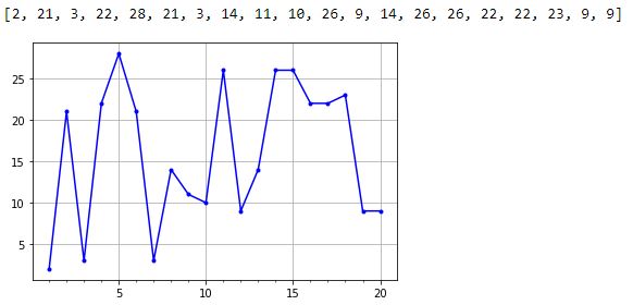
The major and minor tick increments are now 5 and 1, respectively, and the decimal values are gone.
Thus far, the existing code is:
> from matplotlib.ticker import MultipleLocator
> import matplotlib.pyplot as plt
> import numpy as np
> import pandas as pd
> import random
>
> randomlist = []
> for i in range(20):
> n = random.randint(1,30)
> randomlist.append(n)
> print(randomlist)
>
> randomlist_x = list(range(1, len(randomlist)+1))
> fig, ax = plt.subplots(1)
>
> ax.plot(randomlist_x, randomlist, marker=’.’, color=’b’) #plot, not plt
> ax.xaxis.set_major_locator(MultipleLocator(5))
> ax.xaxis.set_minor_locator(MultipleLocator(1))
>
> plt.grid()
> plt.show()
I will continue next time.
Categories: Python | Comments (0) | PermalinkDebugging Matplotlib (Part 2)
Posted by Mark on May 5, 2022 at 07:20 | Last modified: March 15, 2022 11:40In finding matplotlib so difficult to navigate, I have been trying different potential solutions found online. Some have an [undesired] effect and others do nothing at all. Instances of the latter are particularly frustrating and leave me determined to better understand. Today I will begin explaining what I aim to do with visualizations in the backtesting code.
The first graph I wish to present is cumulative backtested PnL on a daily basis. I create a dataframe column ‘Cum.PnL’ to calculate difference between current and original position price. To each entry in this column, I add realized_pnl. Whenever a trade is closed at profit target or max loss, I increment realized_pnl by that amount.
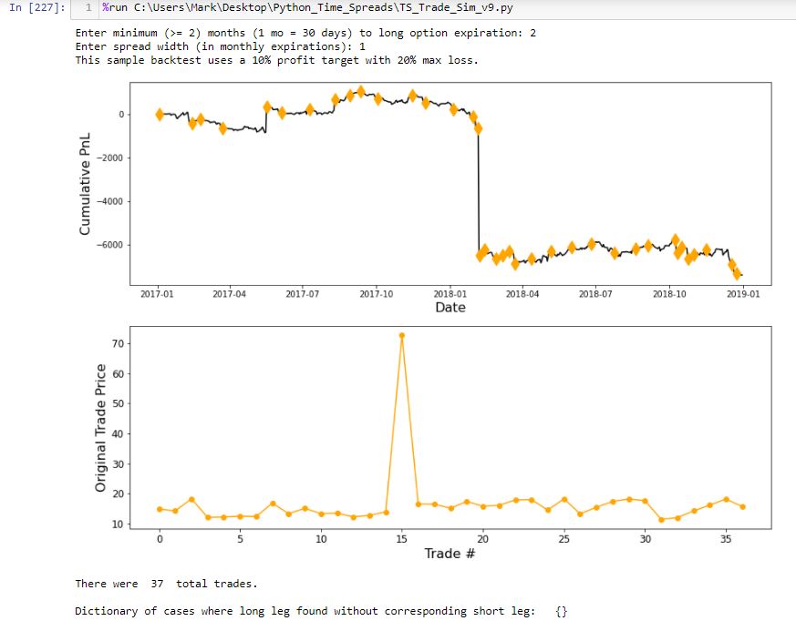
Graphing this results in a smooth, continuous cumulative PnL curve except for one extreme gap. Closer inspection reveals the price of one option on this particular day over $50 more than it should be, which translates to the $5,000+ loss seen here:
The lower graph shows initial position price and makes it clear that something is way out-of-whack with trade #15. I manually edit that entry in the data file.
The upper graph includes an orange diamond whenever a new trade begins. I endured days of frustration trying to figure out how to do this. To better understand my solution, I will create a simpler example devoid of the numerous variables contained in my backtesting code and advance one step at a time to avoid quirky errors.
First, I will import packages (or modules):
> import matplotlib.pyplot as plt
> import numpy as np
> import pandas as pd
> import random
Next, I will create a random list:
> randomlist = []
> for i in range(20):
> n = random.randint(1,30)
> randomlist.append(n)
> print(randomlist)
This prints out a 20-element list of random integers between 1 and 30. A few iterations got me this:
[30, 24, 3, 29, 20, 7, 29, 25, 25, 20, 15, 24, 8, 13, 9, 14, 19, 30, 1, 5]
I like this example because it has both 1 and 30 in it to demonstrate inclusivity at each boundary.
Next, I will invoke matplotlib’s “simplicity” by generating a graph in just three (not including the blank) lines:
> fig, ax = plt.subplots(1)
>
> ax.plot(randomlist, marker=’.’, color=’b’) #plot, not plt
> plt.show()
So far, so good!
I now want to fix two issues with the x-axis. Because I did not specify x-values, these are plotted by default as zero-indexed order in the data point sequence. This assigns x-value 0 to the first data point, 1 to the second, etc. I want 1 for trade #1, 2 for trade #2, etc. The other issue is that because all x-values are integers, I do not want any decimals in the x-axis labeling.
My solution will be to create a list of numbers I want plotted on the x-axis. The downside to this, however, is loss of matplotlib’s automatic scaling, which it sometimes does very well as seen on the ‘Date’ axis above. Maybe this will still work with integers. We shall see.
I will continue next time.
Categories: Python | Comments (0) | PermalinkDebugging Matplotlib (Part 1)
Posted by Mark on May 3, 2022 at 07:28 | Last modified: March 11, 2022 16:28Matplotlib is giving me fits. In this blog mini-series, I will go into the What and try to figure out the Why.
The matplotlib website says:
> Matplotlib is a comprehensive library for creating static, animated, and interactive
> visualizations in Python. Matplotlib makes easy things easy and hard things possible.
The DataCamp (DC) website says:
> Luckily, this library is very flexible and has a lot of handy, built-in defaults that
> will help you out tremendously. As such, you don’t need much to get started: you
> need to make the necessary imports, prepare some data, and you can start plotting
> with the help of the plot() function! When you’re ready, don’t forget to show your
> plot using the show() function.
>
> Look at this example to see how easy it really is…
I have found matplotlib to be the antithesis of “easy.” I am more in agreement with this previous DC paragraph:
> At first sight, it will seem that there are quite some [sic] components to consider
> when you start plotting with this Python data visualization library. You’ll probably
> agree with me that it’s confusing and sometimes even discouraging seeing the
> amount of code that is necessary for some plots, not knowing where to start
> yourself and which components you should use.
Using matplotlib is confusing and certainly discouraging. Many things may be done in multiple ways, and compatibility is not made clear. Partially as a result, I think some things do absolutely nothing. Support posts are available on websites like Stack Overflow, Stack Abuse, Programiz, GeeksforGeeks, w3resource, Python.org, Kite, etc. Questions, answers, and tutorial information spans over a decade. Some now “deprecated” solutions no longer work. Also adding to the confusion are some solutions that may only work in select environments, which is not even something I see discussed.
What I do see discussed is how easy and elegant matplotlib is to use. I seem to be experiencing a major disconnect.
Maybe the difference is the simplicity of the isolated article examples in contrast to the complex application I am trying to implement. Why would my application be more complex than anyone else’s, though? I am trying to develop a research tool where the results are unknown. While different from writing sample code to present already-collected data, that would be a weak excuse. Discovering previously-hidden relationships is a common motivation behind data visualization.
To learn programming with matplotlib, my rough road has left me only one path: debug the process to understand why my previous attempts have failed. That is where I will start next time.
Categories: Python | Comments (0) | PermalinkTime Spread Backtesting in Python (Part 1)
Posted by Mark on March 7, 2022 at 06:35 | Last modified: January 7, 2022 11:33Recently, I did a blog mini-series manually backtesting the COVID-19 crash with time spreads. I left off suggesting backtesting of a slightly rather than extremely bullish time spread as more representative of the long-term market.
One benefit to manual backtesting is a closer look at the day-by-day PnL of each and every trade. Seeing this is a closer approximation to live trading than only seeing the trade result.
Ultimately though, Python is where I want to be for automation, for efficiency, and for all of my backtesting needs. Manual backtesting takes much longer. It also requires me to go back and do many other calculations whenever I want a slightly different look at the data, whenever I want to calculate additional trade statistics, etc.
For me as a beginner, Python has a big temporal cost. That won’t change unless I work consistently to improve my skills.
I want to try and organize my thoughts about this backtesting and maybe come up with a flow chart before I actually try writing any code. I’ve been advised this can help prevent me from getting stranded in the weeds spending lots of time ironing out bugs that aren’t all that important.
This might be a decent time to start transitioning to Python since I’ve been backtesting in ONE and have a fresh sense of what the process entails.
Part of the process I won’t have with Python includes risk-graph management, which is prominently displayed in ONE. Without programming Black-Scholes (way too difficult for my current proficiency), I won’t have any ability to model the trade in Python. I therefore won’t see a profit tent, day steps, or PnL breakevens. I can’t reject the possibility this affects my [manually backtested] Practice Trades, but no risk graph information is called by trade guidelines so hopefully this isn’t an issue.
The .csv data file includes greeks, which will allow for some common techniques of trade management.
To start, I need to think about what I want the program to output and what it will take as input. Here is a snippet of the option data file that gets purchased as .csv archives:
The actual data file has more columns. For time spreads, I will need all greeks but gamma along with IV.
The spreadsheet column headers I have been using in recent manual backtesting provide a starting point for the kind of data I’m looking to collect. Reading down:
Trade #
ONE Trade #
DTE
SPX
MR
Theta
TD
IV
NPD
NPV
MDD %
DTE
Max MR
# Adj
Exit DTE
ROI
SD Chg
IV Chg
DIT
Horiz Skew %
TD
Comments
I will continue next time.
Dictionary Struggles in Python (Part 2)
Posted by Mark on January 7, 2022 at 07:09 | Last modified: November 10, 2021 10:08Today I want to continue discussion from last time about problems I had coding a dictionary application in Python.
Despite the fix already described, I remained puzzled with regard to speed of the original program. I added some #debug lines for timing purposes and also to display progress:
The last line prints out as ~50 seconds, but it takes an additional ~100 seconds before the graph renders and execution concludes. What’s taking the additional 100 seconds? And why does it take even 50 seconds to loop through the dictionary? The dictionary has 717 key-value pairs, which doesn’t seem like that much. These questions remain unanswered.
Iterating over the dictionary is not uniform. It goes slowly until about 200-300 and then prints up to 500 in an instant, to 700 and done. The last 400 or so are lightning fast while the first 200-300 are really slow. I get similar results with this code in Spyder and Jupyter Notebook.
The if statement explains this lack of uniformity. The program should go faster for keys > 250 since nothing is to be done. Only qualifying keys are to be plotted.
Is the conditional statement evaluating dictionary order or value of the key (not to be confused with the key’s corresponding value)? Consider the dictionary {3:29, 8:32, 1:16}. Keys under 10 include the first and second one (or 0th and 1st one given zero-indexing). If this referred to order, then all keys would be under 10 since only the dictionary has only three keys. This doesn’t make logical sense since dictionaries are unordered.
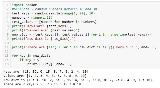
That keys are evaluated in terms of inherent value is verified by this code:*
As I run this code over and over several times, I get a varying number of keys > 5 in the last line. If the conditional referred to order, then five keys > 5 would always be identified (i.e. the sixth, seventh, eighth, ninth, and tenth).
The moral of this story is hard to say. I definitely don’t want to plot every point every time. I want to iterate over each point and plot if it qualifies. Even better, probably, would be plotting all points at once. That might also save more time. I need to study the code closer to figure out how to do that.
* — Line 2 should read: “generate 10 random numbers between 1 and 20.”
Dictionary Struggles in Python (Part 1)
Posted by Mark on January 4, 2022 at 07:08 | Last modified: November 10, 2021 09:54Today I want to go over some dictionary lessons learned from a recent Python exercise.
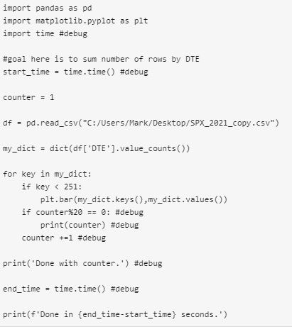
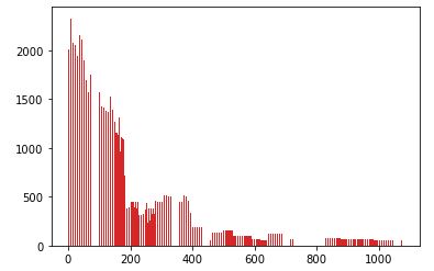
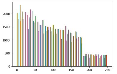
My goal was to go through the 2021 .csv file and sum/graph number of rows by DTE. I had trouble to start, so I capped the initial range at 250.
I started with this:
The result was this:
Two unexpected things happened: x-values larger than 250 show up and the program takes nearly two minutes to run.
My first mistake is using .keys() and .values(), which generate lists of all keys and all values when I only want keys < 251 and their single corresponding values.
Not only are all key-value pairs plotted, what can't be seen is that they are plotted many times. All key-value pairs are plotted whenever a key under 251 is found. The dictionary has length 751 with 184 keys < 251. I believe a total of 751 * 184 = 138,184 total points are plotted.
I eventually modified the code as follows:

This takes ~0.5 seconds, which is a substantial performance improvement. In addition, when a qualifying key is detected through the iteration process, only the corresponding key-value pair (rather than the whole dictionary) is plotted.
I will continue next time.
Categories: Python | Comments (0) | PermalinkReview of Python Courses (Part 34)
Posted by Mark on November 22, 2021 at 07:30 | Last modified: December 22, 2021 09:20In Part 33, I summarized my Datacamp courses 98-100. Today I will continue with the next three.
As a reminder, I introduced you to my recent work learning Python here.
My course #101 was Introduction to Git. GitHub is a website used for collaboration by sharing projects. This course focuses on Git, which is the tool used on GitHub (and some other sites). The course covers:
- What is version control?
- Where does Git store information?
- How can I check the state of a repository?
- How can I tell what has changed?
- What is in a .diff?
- What is the first step in saving changes?
- How can I tell what’s going to be committed?
- How can I edit a file?
- How do I commit changes?
- How can I view a repository’s history?
- How can I view a specific file’s history?
- How do I write a better log message?
- How does Git store information?
- What is a hash?
- How can I view a specific commit?
- What is Git’s equivalent of a relative path?
- How can I see who changed what in a file?
- How can I see what changed between two commits?
- How do I add new files?
- How do I tell Git to ignore certain files?
- How can I remove unwanted files?
- How can I see how Git is configured?
- How can I change my Git configuration?
- How can commit changes selectively?
- How do I re-stage files?
- How can I undo changes to unstaged files?
- How can I undo changes to staged files?
- How do I restore an old version of a file?
- How can I undo all of the changes I have made?
- What is a branch?
- How can I see what branches my repository has?
- How can I view the differences between branches?
- How can I switch from one branch to another?
- How can I create a branch?
- How can I merge two branches?
- What are conflicts?
- How can I merge two branches with conflicts?
- How can I create a brand new repository?
- How can I turn an existing project into a Git repository?
- How can I create a copy of an existing repository?
- How can I find out where a cloned repository originated?
- How can I define remotes?
- How can I pull in changes from a remote repository?
- What happens if I try to pull when I have unsaved changes?
- How can I push my changes to a remote repository?
- What happens if my push conflicts with someone else’s work?
This does it for my review of Datacamp Python courses.
Categories: Python | Comments (0) | Permalink