Musings on Naked Puts in Retirement Accounts (Part 2)
Posted by Mark on May 26, 2017 at 06:25 | Last modified: October 14, 2017 07:21Today I want to continue the comparison between vertical spreads and naked puts (NP) to better understand the pros/cons when traded in retirement accounts.
Employing leverage makes for a more compelling IRA strategy but a very clear and present danger exists. Look at the graph shown in the previous post. At expiration, a 100% loss on the vertical spread will be incurred if the market falls to 419. The naked put, in this case, will have lost no more than (497 – 419) / 497 * 100% = 16%.
Market crash scenarios must therefore be considered. Throughout history, the market has periodically incurred drops equal to or greater than the magnitude just described. I must limit position size as an attempt to prevent total spread risk from striking too damaging a psychological blow to my total net worth in case this should occur.
Wrapping my brain around the concept of leverage has been challenging. In the first blog post hyperlinked above, I wrote:
> Suppose I sell a 1000 put for $3.00 and buy a 500 put
> for $0.30. I have sacrificed 10% of my potential return
> to halve my risk. If I traded two of these spreads then
> I have similar risk to the single naked 1000 put and my
> potential profit is $2.70 * 2 = $5.40 instead of $3.00.
The italicized clause is correct: risk in either case is roughly $1,000 * $100/contract = $100,000. However, the market must crash to zero for the NP to realize max loss. The market must only drop to 500 for max loss to be realized on the vertical spread. This is extremely rare but think back to the 2008 financial crisis for a point of reference.
In Part 1 of the link hypertexted above, I wrote:
> A leveraged account can go to zero long before the
> underlying assets do.
Leverage is dangerous because losses are magnified when the market moves against me. This is the flip side of what makes leverage attractive: lowering the cost to enter a position.
The vertical spread is like a NP on steroids. While total risk is decreased (assuming constant position size), the probability of losing everything at risk is increased. For this reason and because a NP qualifies under the “unlimited risk” umbrella, my instincts recommend limiting portfolio allocation for these short premium strategies to 20%.
I think the vertical spread can offer one additional benefit in case of that dreaded market crash. This I will cover next time.
Categories: Financial Literacy | Comments (1) | PermalinkMusings on Naked Puts in Retirement Accounts (Part 1)
Posted by Mark on May 23, 2017 at 07:25 | Last modified: April 3, 2017 13:24I am not a proponent of trading naked puts (NP) in retirement accounts. The addition of a long put converts the NP to a put vertical spread. Might the vertical be a candidate for retirement account trading?
My argument against NPs in retirement accounts begins with the observation that retirement accounts cannot be margin accounts. I was unable to find a particular regulation that prohibits this but I don’t know of any brokerage that allows an [Roth] IRA to support any kind of loan. Margin is a loan, which would therefore be prohibited in an [Roth] IRA account.
Being resigned to trade NPs in a cash account simply does not seem like an attractive use of capital. If I have a $100,000 account then I can only sell one 1000 NP. If the put trades for $3.00 then this is a 0.3% return. If I can do this once per month then my potential annualized return is about 3.6%. As Shania Twain used to say, that don’t impress me much.
Portfolio margin—not suitable for a retirement account (see above)—makes the most sense to me for trading NPs.
Employing leverage by purchase of a long put is one alternative to make NPs more attractive for retirement accounts. In the previous example, if I buy the 900 put for $1.00 then I cut risk by 90%. Now I might be looking at a return of 2% per month or 24% per year. This is worth considering.
While purchase of the long significantly boosts potential ROI, it is not a panacea. The vertical spread does not affect maximum drawdown (DD) unless the market falls far enough to put the long put ITM. If the long put is purchased for cheap then this represents a significant market crash, which is rare. Similarly, the vertical spread does not decrease standard deviation of returns (another measure of risk as discussed here and here) unless that “significant market crash” occurs.
To illustrate, below is a risk graph of a naked put and a put vertical spread:
The red arrows highlight how the vertical spread stops losing money by 419 on the downside (green line) whereas the NP continues to lose money as the market drops below 419 (brown line).
Other disadvantages to the vertical spread include the additional cost and transaction fees. Being two options instead of one, a vertical spread usually incurs twice the transaction fees as a NP. Based on my experience trading in fast-moving markets, I would expect to pay [much] more than 2x under these rare conditions. This makes sense to me because under these circumstances, the most efficient way for a market maker to survive is by taking the simplest trades and executing them quickly to serially mediate risk.
I will continue this discussion next time.
Categories: Financial Literacy | Comments (2) | PermalinkLeverage (Part 2)
Posted by Mark on May 18, 2017 at 06:05 | Last modified: March 28, 2017 12:09I left off discussing the concept of leverage with regard to my previous backtesting. Today I will go one step further.
I believe maximum drawdown (DD) is as important a performance component as net income (also “total return”) because use of max DD to calculate position size can minimize risk of Ruin. If you don’t care about blowing up (i.e. Ruin) then it’s simply a matter of what can keep you from a good night’s sleep. DD is the answer here as well.
Position size is one of two ways leverage may be managed. Investment advisers assess risk tolerance in an attempt to help clients maintain a good night’s sleep. Account size and risk tolerance together viewed in terms of variable DD levels determine position size. This is not an exact science because maximum DD is only known in retrospect, which is why it’s called “investing” rather than just “winning.”
In Naked Put Study 2, maximum DD is 3.7x larger for long shares than for naked puts (NP). If I position sized the long shares properly to maintain that good night’s sleep then the NP position sizing could have been up to 3.7x larger without incurring a worse DD. This equates to net income 127% larger for NPs than for long shares.
Besides changing position size, the second way to manage leverage is to employ put credit spreads instead of NPs. I brainstormed this idea here and here.
The long put offsets “unlimited risk” by narrowing the width of the spread. If I sell a 1000 put then the potential loss is 1,000 points * $100/point = $100,000. If I also buy a 500 put for dirt cheap then my potential loss is only (1000 – 500) points * $100/point = $50,000. I halve my risk for only a slight decrease in net profit. Employing leverage in this way creates a cheaper trade with a similar potential return.
The benefit of buying long puts may be seen by equating the total risk. Suppose I sell a 1000 put for $3.00 and buy a 500 put for $0.30. I have sacrificed 10% of my potential return to halve my risk. If I traded two of these spreads then I have similar risk to the single naked 1000 put and my potential profit is $2.70 * 2 = $5.40 instead of $3.00. That is an increase of 80%.
I prefer some decrease in total risk when I employ leverage. Instead of selling two 1000 puts for $6.00 and incurring $200,000 risk, perhaps I sell three 1000/500 spreads and incur $150,000 risk while having a potential profit of $2.70 * 3 = $8.10. This is a 35% increase in profit potential with a 25% decrease in risk. I like that.
Categories: Financial Literacy | Comments (1) | PermalinkLeverage (Part 1)
Posted by Mark on May 15, 2017 at 07:04 | Last modified: February 14, 2017 16:55When I think about the largest catastrophes ever attributable to options (arguably LTCM and the 2008 financial crisis, which involved an alphabet soup of derivatives), one word that sums up the root cause is “leverage.”
Leverage is important—not only when it comes to television but most assuredly when it comes to options. Investopedia defines leverage as: “the use of various financial instruments or borrowed capital, such as margin, to increase the potential return of an investment.” It goes on:
> For example, say you have $1,000 to invest.
> This amount could be invested in 10 shares of
> Microsoft (MSFT) stock, but to increase leverage,
> you could invest the $1,000 in five options
> contracts. You would then control 500 shares
> instead of just 10.
A cash account that does not allow trading on margin employs no leverage. The only way to “blow up,” or lose everything, is to invest the entire account and see the underlying assets (for long positions) go to zero. It’s very rare that stock prices go to zero (e.g. corporate bankruptcy). No broad-based (U.S.) index has ever gone to zero.
While leverage is exciting because upside exceeds 1:1, the same may occur on the downside resulting in a greater risk of blowing up. A leveraged account can go to zero long before the underlying assets do.
I have previously done research aiming to compare performance between long shares and naked puts (NP) while keeping leverage constant. This discussion can be seen here and here. I added $5M of risk each day and when I removed risk in one group, I removed the same amount of risk in the other.
The graphs shown here and here are particularly powerful. They show the NP strategy to generate a lower gross return and a much lower drawdown (DD).
While increasing leverage is effectively an increase in position size, position size can be too large without employing any leverage. Long shares purchased in cash accounts are not utilizing margin but the account can still blow up. In retrospect, the position size can always be said to have been too large. The minimum capital to trade a strategy is at least the maximum DD ever seen and the longer a backtest, the more likely the backtested max DD is to meet or exceed future market pullbacks. This certainly is not guaranteed and given a long enough trading horizon is not even likely.
I will continue next time.
Categories: Financial Literacy | Comments (1) | PermalinkAre You Getting What You Paid For?
Posted by Mark on May 5, 2017 at 06:43 | Last modified: December 14, 2016 10:49The title of this post is the first line of the November 2016 AAII Journal “Editor’s Note” written by Charles Rotblut, CFA. I previously established that having someone else do the investing is going to cost in terms of fees and probably performance. I believe paying fees is okay as long as one knows exactly what fees are being paid.
Rotblut writes:
> Even a 1% [management] fee should raise
> questions… If both the S&P 500 and the fund
> achieve a 7% return, you lose 14%… your after-
> fee gain is not 7%, but 6%, a 14% difference.
This is misleading. Calculating percentage of percentages is a great way to magnify numbers and make them seem more sensational. To recoup a 1% fee, my adviser needs to do 1% better than the benchmark—not 14%.
> It’s not unusual to see companies pitch
> newsletters and strategies promising market-
> beating returns. Ask how they are calculated
> and you will often find out that they are
> based on backtesting or paper trades. Run
> the strategy in an actual portfolio where
> trading and transaction costs matter and
> the returns may be significantly lower.
These are excellent points. I mentioned this here in addition to a lengthy discussion beginning here.
My latest realization is that most people are probably paying more than just advisory fees. The management fee is most common and this goes straight to the adviser. My experience suggests most advisers buy mutual funds or ETFs for their clients and as shown in prospectus examples, all of these funds charge operating fees at the very minimum. So whether I hire a human or robo-adviser, I will likely be paying fees to the fund companies in addition to the advisory management fee. These additional fees may remain hidden unless I study the prospectus or ask the adviser.
> …if you are going to pay for active
> management or professional advice, be
> sure you are getting what you pay for.
This sounds good but how can it possibly be measured? For many people, I think customer satisfaction is as straightforward as beating the “benchmark” and/or seeing the investments grow.
Rotblut further explains:
> Are you getting better returns, more income,
> better education on how to invest or help
> in staying disciplined over the long term?
> [italics mine]
I covered the first two above. #3 is meaningless. “Better” education: better than what? I doubt I could even assess this. #4 is also meaningless because “help in staying disciplined over the long term” is only something that can be evaluated in retrospect. Bailing out in the midst of a market crash means I wasn’t disciplined if the market subsequently rebounds leaving me on the sidelines. Years of paying fees may pass before an event like this ever occurs.
When shopping for a financial adviser, I think it is important to identify the complete fee structure to allow for apples-to-apples comparison between different services. I’m skeptical as to whether I can determine if I am (will be) getting what I pay for. The meaningful decision is whether I want to bite the bullet and pay someone else for what I would otherwise have to do myself.
Categories: Financial Literacy | Comments (0) | PermalinkWhen Performance is Irrelevant (Part 5)
Posted by Mark on May 2, 2017 at 07:00 | Last modified: November 22, 2016 11:03This blog mini-series started out with some mutual fund prospectus examples (here, here, and here) to understand and critique how investment performance is reported. Today I continue with more excerpts from Jaclyn McClellan’s article discussing mechanics of performance comparison.
Aside from using rolling periods, another way to generate a larger sample of [potential] performance records is through Monte Carlo simulation. This has been mentioned multiple times in this blog (e.g. here, here, and here).
> Also, many of the robo services haven’t been
> around long enough to present meaningful longer-
> term return figures, hence the reporting of
> backtested results.
I am okay with using backtested results as long as the backtesting is done in a realistic manner. In order to know this, the methodology must be explicitly presented. While this is routinely done in peer-reviewed scientific journals, I have rarely seen such detailed description in financial materials like a prospectus or seminar.
> Each company stated that they have historical
> performance figures available; however, there
> were caveats. In order to see historical
> performance for Alpha Architect, MarketRiders,
> and Rebalance IRA, you must have an account.
I don’t need to be a member of Costco to walk through the store and see what kind of merchandise they offer. Why should I need to open an account simply to sample past performance?
> Alpha Architect will send historical figures
> to prospective clients on a case-by-case basis,
> or refer clients to their book, “DIY Financial
> Advisor: A Simple Solution to Build and Protect
> Your Wealth” (Wiley Finance, 2015) where the
> strategies are defined, explained and analyzed.
This sounds like a less-invasive marketing tactic than requiring me to open an account.
In summary, perhaps nothing in finance is respected more than the almighty performance record. Aside from the proper legal documents, to open a hedge fund I need little more than an audited performance record. I don’t need a degree. I don’t need a license. I don’t need a resume.
Unfortunately though, reasonable doubt challenges the validity of most traditional performance records whether or not they are officially audited. Many people think the key is what performed best in the past. I disagree. The key is what performed well in the past and/or has the best chance of performing well into the future. To determine this we need to assess for fluke occurrence. Large sample sizes, Monte Carlo simulation, and walk-forward analysis are means to this end: three tools not traditionally implemented when reporting investment performance.
Categories: Financial Literacy | Comments (0) | PermalinkWhen Performance is Irrelevant (Part 4)
Posted by Mark on April 27, 2017 at 07:11 | Last modified: November 22, 2016 10:37The motivation for this blog mini-series stems from an article on “robo-advisers” by Jaclyn N. McClellan in the Oct 2016 AAII Journal. With regard to performance comparison, she writes:
> A major question many investors ask is, “How
> does the performance of the robo-advisers
> compare to that of traditional advisers?”
> This is not a question that is easy to answer.
>
> Most of the robo advisory services that post
> performance online display backtested or model-
> based results…
That may be inaccurate because live-trading execution can significantly differ from backtesting (or based on models). They would need to present the research methodology (examples given here and here), which is usually not done.
> Each robo-adviser has different inception
> dates, and some don’t disclose those dates.
This is also true with regard to mutual funds, which makes it very difficult to pick up one prospectus and compare with another. Not giving the inception date seems absurd.
> Prospective clients have to search for the
> performance disclosures just to read the fine
> print…
This is consistent with the mutual fund prospectus. None of this is straight-up, transparent disclosure although I’m sure their compliance departments would claim to be meeting regulatory standards.
> Although the lack of sound performance figures
> may seem disheartening, displaying truly
> representative returns is difficult because
> many investors have customized portfolios—
> fees, allocations and rebalancing intervals can all
> be different on an account-by-account basis.
> Clients open accounts at different times, so
> even if the respective risk/reward profile
> categories don’t change, the starting value will.
The countless number of potential permutations of an investment account is another reason why it seems inappropriate to use a single historical record to measure performance.
An alternative to showing a single number for 1-year (5-year) performance, for example, would be to show a distribution of rolling 1-year (5-year) performance records. A fund that has been around for two (10) years has roughly 252 (1,260) rolling 1-year (5-year) periods that may be sampled. I could then look at the mean, standard deviation, and percentiles to make good sense out of these numbers, which constitute a much more robust sample size.
I will continue next time.
Categories: Financial Literacy | Comments (0) | PermalinkWhen Performance is Irrelevant (Part 3)
Posted by Mark on April 24, 2017 at 07:32 | Last modified: November 22, 2016 09:48In this blog mini-series I’m considering the possibility that financial performance reporting is at least misleading and at most irrelevant. As a third example, today I will discuss a prospectus for the T. Rowe Price Value fund.
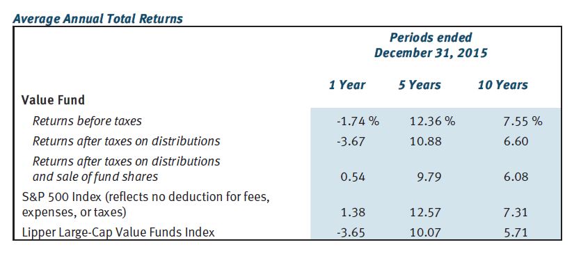
First, take a look at the following table:
This gives us something against which to compare the fund’s performance. The Value Fund outpaced S&P 500 over 10 years but fell short over one and five. Value Fund beat the benchmark (Lipper Large-Cap Value Funds Index) over all three time frames but operating expenses (0.81%) are not included. Your actual performance would therefore fall short of the numbers reported here.
Once again, why be deceptive? Why not provide a historically accurate report of how the fund performed?
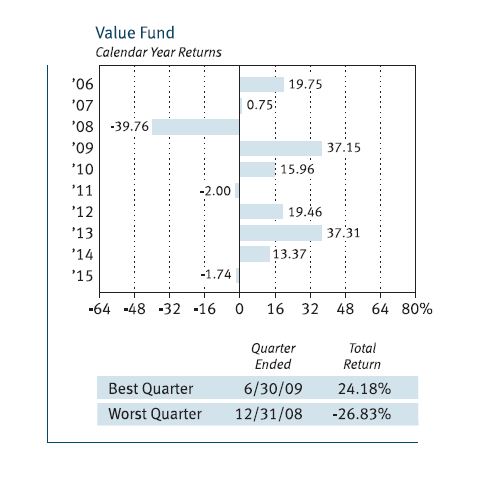
The prospectus also includes the following graph:
This gives us a 10-year track record to look at, which is better than the two years seen with American Funds Growth Portfolio. Ten is still a small sample size, though.
What may be worse is that each of the 10 samples is itself far too small a sample. I mentioned this with regard to the Vanguard prospectus: we do not see any error bars on the graph.
What happens in any particular calendar year is only one representation of an infinite number of potential occurrences. What if a large bankruptcy had been announced December 29 instead of January 5? What if Friday fell on the 31st instead of the 1st causing a jobs report to be delayed a week? What if a verbal misunderstanding, a dropped call, or a random muscle twitch had resulted in two countries going to war?
The fact that altered events can theoretically result in significant performance differences suggests just how trivial any single sample is. For me this is strong motivation for Monte Carlo simulation.
Monte Carlo simulation is a methodology used to generate large sample sizes. Given a system with many trades, toss the profit/loss numbers into a hat, mix thoroughly, and pick randomly to get different trade sequences. This can be done thousands of times. Robust descriptive statistics may then be used to generate and discuss probability-based future predictions of performance.
Monte Carlo simulation is unfortunately the exception—not the rule. Singular performance numbers based only on specific historical records are routinely reported. Laypeople in droves (along with their investment advisers) make frequent decisions based on these reports that, I would argue, are statistically meaningless.
This is a big reason why I suspect financial performance may be irrelevant.
Categories: Financial Literacy | Comments (0) | PermalinkWhen Performance is Irrelevant (Part 2)
Posted by Mark on April 21, 2017 at 06:19 | Last modified: November 18, 2016 10:26In this blog mini-series I’m considering the possibility that financial performance reporting is at least misleading and at most irrelevant.
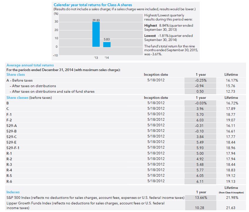
Last time I briefly discussed a prospectus for a Vanguard fund. As a second example, let’s look at the American Funds Growth Portfolio prospectus:
The first thing I noticed here is the short track record. The bar graph only shows performance for two years since the fund opened May 2012. Instead of 10 tiny samples (Vanguard), here we have two tiny samples.
An additional problem is a failure to include the sales charge. The disclaimer “if a sales charge were included, results would be lower” is nice but they don’t tell us how much lower it might be. I would like to see the maximum possible sales charge included as they did in the table. If the worst-case performance is acceptable then I’m more likely to invest. Either way, the point of a graph is to show and they failed to do that because what they graphed is not realistic.
The table indicates that every share class (of which there are many) underperformed the S&P 500 and the benchmark (Lipper Growth Funds Index). This is not encouraging but again, the sample size is sufficiently small here to mean very little. For a quick second I am happy that they at least included the sales charge.
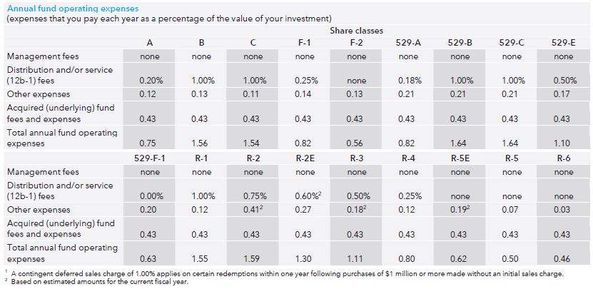
But don’t think for more than a second that they reported the actual performance because other fees are not included. Evidently it does not pay to look only at the performance section because earlier in the prospectus we see:
“Operating expenses” range from 0.46% – 1.64% annually. I called to get more information and only Class A and Class C shares are available to me as a prospective retail investor (“individual nonqualified account”). That means I would be stuck with a 0.75% annual fee on top of a 5.75% load (sales charge) and 1% redemption charge or a 1.54% annual fee with no load and a 1% redemption charge. Unfortunately neither annual fee nor redemption charge is included in the graphs or the tables, which means the reported performance numbers are optimistic exaggeration.
Is this deceptive advertising?
I will continue next time with one final example.
Categories: Financial Literacy | Comments (1) | PermalinkWhen Performance is Irrelevant (Part 1)
Posted by Mark on April 18, 2017 at 07:26 | Last modified: November 18, 2016 12:45Plenty of reasonable doubt suggests traditional reporting of financial performance is irrelevant and serves only to mislead.
I am not saying reporters of financial performance are aiming to mislead. This post is not categorized optionScam.com. Reporters may occasionally attempt to mislead but certainly not always. I also believe financial reporters often mean well and do exactly what their compliance teams require (e.g. for mutual funds or hedge funds). This can still fall short of the mark, however, which is why society as a whole needs increased levels of financial literacy.
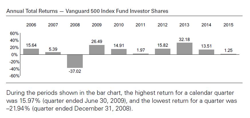
I begin by taking a look at how investment performance is presented today. I did a search for “mutual fund prospectus” and took three hits from Google page 1. Let’s start with the Vanguard 500 Index Fund:
The main critique I have of these numbers is that each year includes only one sample. We don’t see any [standard] error [of the mean] bars here: each number is exactly what the fund returned during that calendar year. People tend to give samples created from a linear combination of historical data added weight and sometimes these historical samples (as opposed to simulated trials) are the only ones people recognize. Statistically speaking it is one and only one sample, however, which makes it the tiniest sample size available aside from zero. I had the same criticism for Craig Israelsen.
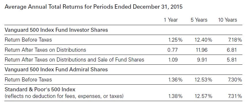
The prospectus also includes the following table:
Nowhere does it state that transaction fees are included in the performance numbers. Transaction fees are mentioned in the last row where benchmark performance is given. While this may imply the fees are taken into account above, we cannot assume this.
I will make one tangential observation here about relative performance. The fund underperforms the benchmark for all three time frames whether looking at Investor Shares or Admiral Shares. Critics of actively managed funds sometimes emphasize large losing margins against the benchmarks. The only way to ever beat the benchmark is to actively invest. A passively managed fund is guaranteed to lose every time because of the fees—regardless of how small those fees might be.
I will continue with two more examples in the next post.
Categories: Financial Literacy | Comments (3) | Permalink
