Resolving the X-Axis (Part 2)
Posted by Mark on June 9, 2022 at 07:22 | Last modified: March 31, 2022 17:30I left off last time with a promising solution for setting x-axis labels using the Matplotlib.Ticker.FixedLocator Class. Unfortunately, the example at the bottom shows this doesn’t work for all values, which calls the solution into question.
What’s going on? Take a look at the following code snippet:
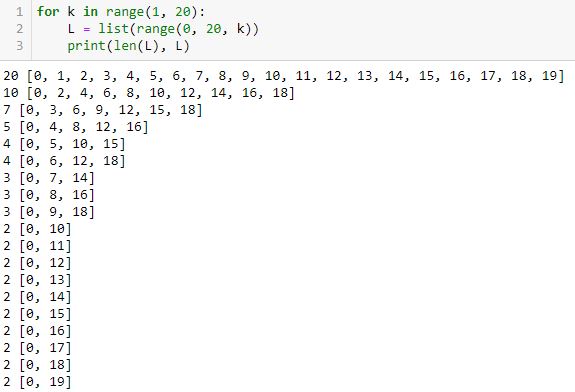
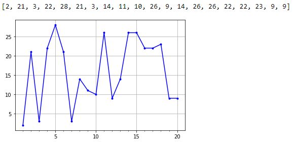
This shows for equally-spaced tick labels having integer coordinates, only certain numbers of labels are possible: 2, 3, 4, 5, 7, 10, and 20. I did not get six because it’s not mathematically possible. The same holds true for 8-9 and 11-19. When multiple equally-spaced lists are possible, I was really aiming for the one with the last element closest to the final date in the list.
In order to code this stuff accurately, I need to articulate exactly what I’m trying to achieve. I failed to do that.
Aside from the FixedLocator Class, another way to approach this is with np.linspace(a, b, c). This automatically creates a linear space of c-point subdivisions between a and b inclusive (i.e. a and b always included as the first and last values):
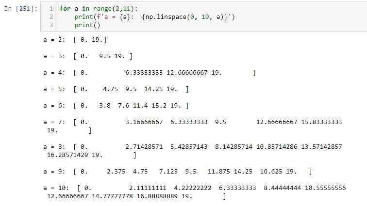
Note how each list begins and ends with 0 (a) and 19 (b), respectively.
How do the plots look with different numbers of x-axis labels?
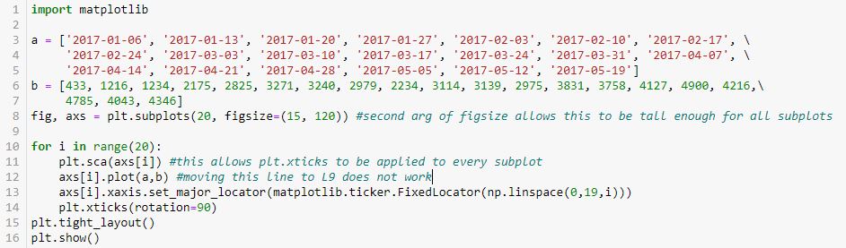
In the interest of space, I will describe rather than show the output. We get 20 subplots where the number of tick labels increases from zero to 19 by an increment of one for each subplot. The graphs are identical—the only thing that changes is the number of equally-spaced tick labels. Outstanding!
Some highlights of this code are as follows:
- The figure and axes are drawn in L8.
- L8 also includes the figsize argument to make the graphs larger (see second paragraph of Part 1).
- plt.sca(), as originally shown in L35 of this second code snippet, rotates x-axis labels for each subplot (a simple thing that took major work to figure out).
- L10 and L13 are basically applying the np.linspace() exercise shown above to the x-axis labels on the subplots.
I’m quite happy with the progress made here!
Categories: Python | Comments (0) | PermalinkResolving the X-Axis (Part 1)
Posted by Mark on June 6, 2022 at 07:30 | Last modified: March 31, 2022 11:52As it turns out (see here and here), some of the matplotlib debugging came down to better understanding the zip() method. I still have some further considerations to resolve.
I would like to enlarge the graph so the axis isn’t so crowded when every label is included.
First though, I want the x-axis tick labels and locations to be handled automatically. I want z labels spaced evenly throughout the time interval from first Friday to last Friday. Alternatively, I may want to try plotting labels only where new trades begin.
When left to plot the x-axis tick labels automatically, others were seeing consistent tick labels on the 1st and 15th of each month as discussed in the third paragraph of Part 7. That would be acceptable, but for some unknown reason, I got asymmetric labels on the 1st and 22nd of each month as shown near the bottom here.
I stumbled upon the Matplotlib.ticker.FixedLocator Class, which is seen in L10 below:
The highlighted number is the number of tick labels that I expect to see. I determined this by trial and error (it requires the minus one). I want constant spacing across these labels and eventually, I’d like the program to calculate the optimal number.
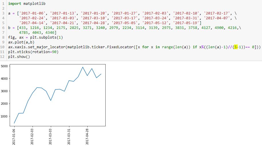
Let’s break this down to see how it works (or not):
> [x for x in range(len(a)) if x%((len(a)-1)//(5-1))== 0]
This is a pretty complicated piece of code for a beginner (me). First, we have to recognize it as a list comprehension: it will generate a list. A list will direct the program to place tick labels at specified locations as shown just above the first graph here.
The list will be generated as follows:
- len(a) is 20 (items in list a).
- range(20) creates a range object starting from 0 and going to 19.
- x for x in range(len(a)) will iterate over the range object and place each entry in the list…
- …if the subsequent condition is met.
- Subsequent condition involves the modulo operator (%), which calls for division remainder.
- Numerator is x.
- Denominator is (len(a)-1) // (5-1)
- // is floor division, which truncates any remainder.
- len(a)-1 // (5 – 1) = (20 – 1) // 4 = 19 / 4 = 4.75, which gets truncated to 4.
- Subsequent condition therefore calls for multiples of 4 (x / 4 will have remainder == 0).
- From 0 to 19, multiples of 4 are: 0, 4, 8, 12, and 16.
- These are exactly the dates shown as x-axis labels (count L3 – L5 dates with first being #0).
If I populate the highlighted number as 1, then I’ll get division by zero (not good). I’d never want just one tick label anyway. Two works along with 3, 4, and 5.
What about 6?
I count seven tick labels.
Houston, we have a problem.
Categories: Python | Comments (0) | PermalinkUnderstanding the Python Zip() Method (Part 2)
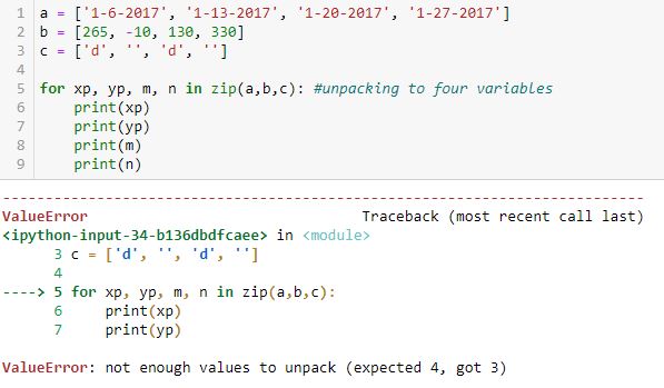
Posted by Mark on June 3, 2022 at 07:26 | Last modified: March 29, 2022 11:39Zip() returns an iterator. Last time, I discussed how elements may be unpacked by looping over the iterator. Today I will discuss element unpacking through assignment.
As shown in case [40] below, without the for loop each tuple may be assigned to a variable:
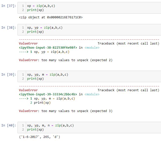
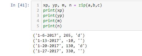
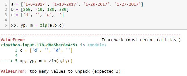
[37] shows that when assigned to one variable, the zip method transfers a zip object. Trying to assign to two or three variables does not work because zip(a, b, c) contains four tuples. As just mentioned, [40] works and if I print yp, m, and n, the other three tuples can be seen:
I got one response that reads:
> But since you hand your zip iterables that all have 4 elements, your
> zip iterator will also have 4 elements.
Regardless of the number of variables on the left, on the right I am handing zip three iterables with four elements each.
> This means if you try to assign it to (xp, yp, m), it will complain
> that 4 elements can’t fit into 3 variables.
This holds true for three and two variables as shown in [39] and [38], respectively, but not for one variable ([37]). Why?
Maybe it would help to press forward with [37]:
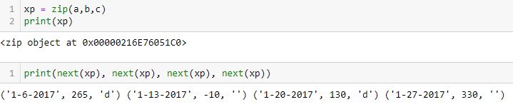
If assigned to one variable, the zip() object still needs to be unpacked (which may also be accomplished with a for loop). If assigned to four variables, each variable receives one 3-element tuple at once.
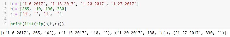
In figuring this out, I was missing the intermediate step in the [un]packing. zip(a, b, c) produces this series:
(‘1-6-2017’, 265, ‘d’), (‘1-13-2017’, -10, ”), (‘1-20-2017’, 130, ‘d’), (‘1-27-2017’, 330, ”)
or
(a0, b0, c0), (a1, b1, c1), (a2, b2, c2), (a3, b3, c3)
xp, yp, m = zip(a, b, c) tries to unpack that series of four tuples into three variables. This does not fit and a ValueError results.
for xp, yp, m in zip(a, b, c) unpacks one tuple (ax, bx, cx) at a time into xp, yp and m.
Despite my confusion (I’m not alone as a Python beginner), zip() is always working the same. The difference is what gets unpacked: an entire sequence or one iteration of a sequence. zip(a, b, c) always generates a sequence of tuples (ax, bx, cx).
When unpacking in a for loop, one iteration of the sequence—a tuple—gets unpacked:
xp, yp, m = (ax, bx, cx)
When unpacking outside a for loop, the entire sequence gets unpacked:
xp, yp, m, n = ((a0, b0, c0), (a1, b1, c1), (a2, b2, c2), (a3, b3, c3))
Understanding the Python Zip() Method (Part 1)
Posted by Mark on May 31, 2022 at 06:44 | Last modified: March 28, 2022 17:39As promised at the end of my last post, I’ve done some digging with some extremely helpful people at Python.org. Today I will work to wrap up loose ends mainly by discussing the Python zip() method.
My first burning question (Part 8) asks why L42 plots a line whereas L45 plots a point. The best answer I received says that matplotlib draws lines between points. If you give it X points then it will draw (X – 1) lines connecting those points. I was pretty much correct in realizing L45 receives one point at a time and therefore draws (1 – 1) = 0 lines.
To understand how L45 gets points, I need to better comprehend the zip() method. Zip() returns an iterator. Elements may then be unpacked via looping or through assignment.
Let’s look at the following examples to study the looping approach.
Unpacking to one variable (xp) outputs a tuple with each loop:
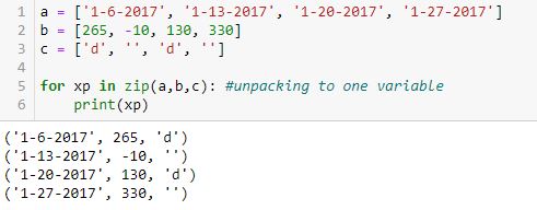
Unpacking to two variables (xp, yp) does not work:
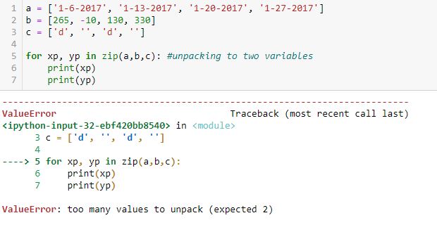
“Too many values to unpack” is confusing to me. If there are too many values to unpack for two variables, then why are there not too many to unpack for one? Perhaps the first example should be conceptualized as one sequence with four tuples. If so, then can’t this be conceptualized as one sequence with two tuples unpacked through two loops each?
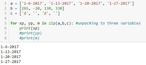
Looping over the iterator with three variables yields this:
To better illustrate how the value from a gets assigned to xp, the value from b gets assigned to yp, and the value from c gets assigned to m, here is the same example with all variables printed:
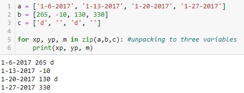
Unlike the top example, these are not tuples as no parentheses appear. Each line is just three values with spaces in between.
Looping over the iterator with four variables does not work:
I understand why four were expected (xp, yp, m, n) and as shown in the previous example, only three lists are available to be unpacked up to a maximum of four times.
Next time, I will continue with examples of element unpacking through assignment.
Categories: Python | Comments (0) | PermalinkDebugging Matplotlib (Part 8)
Posted by Mark on May 26, 2022 at 06:44 | Last modified: March 26, 2022 11:24Getting back to the objectives laid out here, I completed #1 in Part 4, #2-3 in Part 5, and #5 in Part 6. I will resume with objective #4: randomly select five Fridays as trade entries.
This line is pretty straightforward:

Finally, this snippet allows me to conquer objective #6:
This is actually somewhat complex code for a beginner like me. I will go over a few points.
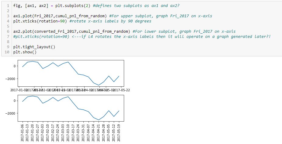
First, note that I have simplified the graph from two subplots to just one. The reason for including two subplots earlier was only to compare tick labels on the x-axis.
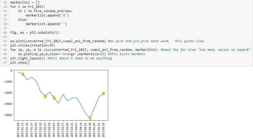
Second, look at the syntax of L45. The arguments are x-values, y-values, marker code, color, and markersize. L42 is an abbreviated version with just the first two arguments. L45 plots the markers while L42 plots the line. How does this work?
In L42, the arguments are datatype list.
In L45, the datatype is more complicated. The first three arguments of L45 are generated in L44 from a zip function. From W3Schools.com:
> The zip() function returns a zip object, which is an iterator of tuples where
> the first item in each passed iterator is paired together, and then the second
> item in each passed iterator are paired together etc.
The zip function itself produces a zip object. Trying to directly unpack the object into variables does not work:
I’m still trying to understand what the “too many values” are. I would expect to get a list of (xp, yp, m) tuples from this.
As it turns out, I can get such a list with the list constructor:
Like the list constructor, the for loop is an iterator that goes over the iterable until nothing is left. Each time, it unpacks three values from the zip object: one from each list. These then get presented to L45 as the x-value, y-value, and marker code. This plots a set of points showing up as diamond markers or blank instead of a continuous line because each time three separate values are presented rather than two lists being presented at once? It’s hard for me to articulate this, which suggests that I don’t fully understand it yet.
Next time, I will do a bit more digging in order to explain this better.
In the meantime, mission accomplished for all six objectives!
Categories: Python | Comments (0) | PermalinkDebugging Matplotlib (Part 7)
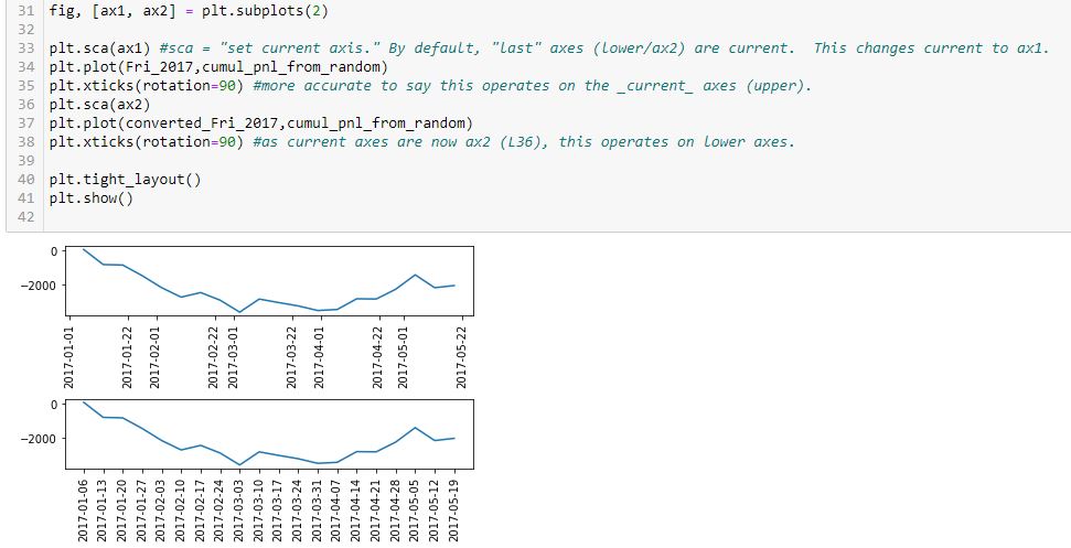
Posted by Mark on May 24, 2022 at 07:10 | Last modified: March 24, 2022 11:17I will pick up today by discussing why the x-axis labels are different for the lower subplots presented in Part 6.
To clarify some terminology, I have been saying “x-axis labels,” which I think is adequately descriptive and perhaps even correct. In different online forums, I have seen mentions of “tick labels” and “tick locations.” The 1st and 22nd of each month are tick locations on a date axis. The tick labels are what get printed at those locations. For dates on a date axis, tick locations and tick labels are identical.
The best answer I received to the original question says that matplotlib (MPL) is probably doing with dates what it does with numbers: calculating evenly-sized intervals to fit the plot (based on first and last values). He reports tick locations at the 1st and 15th of each month, though, which makes more sense as “evenly-sized.” The 21 days followed by 7-10 days I get at the 1st and 22nd of each month are lopsided. Although I still lack explanation for the latter, I did find this SO post showing the same thing (no explanation given there, either).
With regard to this line:
> converted_Fri_2017 = [d.strftime(‘%Y-%m-%d’) for d in Fri_2017] #list comprehension
Values lose meaning when converted to strings. MPL spaces strings evenly without regard to any numeric or date value.
String conversion works in this instance because tick locations = tick labels, but other cases could present problems. One such case would be non-fixed-interval trade entry dates. Another example would be a longer time horizon where too many tick labels may render the x-axis illegible. If left as dates (or datetimes: both worked the same for me) then MPL could potentially scale accordingly (see first sentence of paragraph #3, above), but converting to strings robs MPL of this opportunity.
Much functionality remains with regard to ax.xaxis.set_ticks(), ax.set_xlim(), ax.set_xticks(), ax.set_xticklabels(), ax.tick_params(), plt.setp(), AutoDateLocator, ax.xaxis.set_major_locator(MultipleLocator()) from Part 3, etc. The list goes on, and solutions are varied based on version. That is to say they may have worked when posted, but if subsequent versions have been released (especially with previous functionality deprecated), those solutions may no longer be suitable.
I do not plan to write an encyclopedia of all the available functionality. I will resort to picking and choosing based on any particular needs I have at a given time.
Categories: Python | Comments (0) | PermalinkDebugging Matplotlib (Part 6)
Posted by Mark on May 19, 2022 at 06:28 | Last modified: March 23, 2022 11:06I left off with a seemingly counterintuitive situation where plt.xticks() either effects something yet to be generated or gets undone by something later in the program. After completing that last post, though, I had a shocking realization: I THINK I KNOW THE ANSWER AS A RESULT OF MATPLOTLIB EXCEPTIONS HAVING BEEN RAISED IN MY PAST WORK!
Exceptions are usually frustrating because they force me to problem solve something I inadvertently did wrong. Now, that past frustration proves quite beneficial in leaving the indelible image in my mind of a completely blank graph.
Let me simply the code to include only the imported modules and the first graphing line:
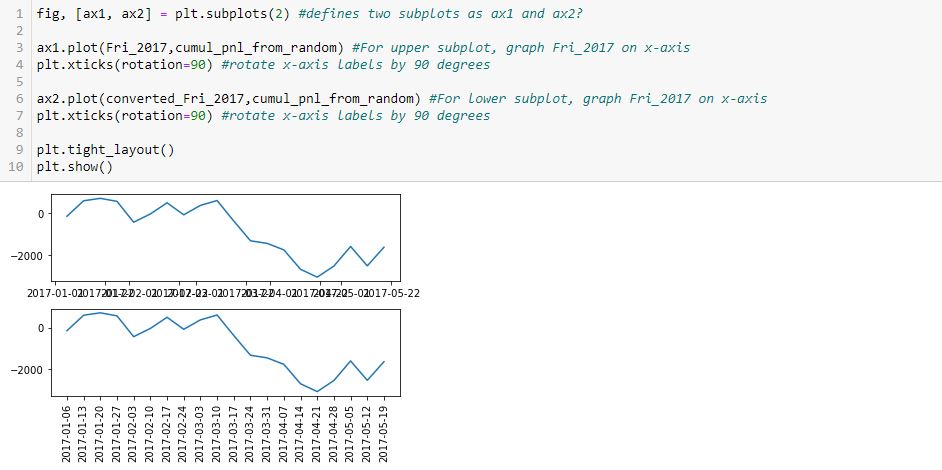
I completely erred in my reasoning throughout the last four paragraphs of Part 5. Neither L3 nor L6 draws any axes. All axes are generated in L1 and this includes the “last [second set of] axes.” L4 and L7 both operate on the second set of axes defined in L1, which is why only the x-axis labels of the lower graph were rotated.
This makes more sense. There is no retroactive operation and no need to hold a command in memory for something not yet generated—both of which seem very “unpythonic.”
Having said all that, experiencing a natural high, and catching my breath, this snippet produces the desired outcome:
Technically correct is to say current axes are those drawn last by default. Current axes may be explicitly set as shown here. This is how to vary the target of plt.xticks() to get x-axis labels rotated on both graphs.
Now…
Why is the spacing of x-axis labels different on these two graphs?
I will address that next time.
Categories: Python | Comments (0) | PermalinkDebugging Matplotlib (Part 5)
Posted by Mark on May 16, 2022 at 07:27 | Last modified: March 22, 2022 16:42Last time, I laid out some objectives to more simply re-create the first graph shown here. I will continue that today.
Objectives #2-3 are pretty straightforward:
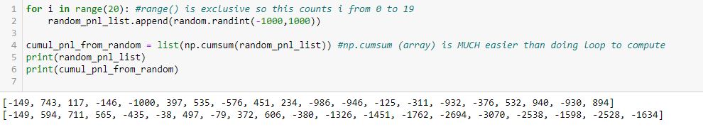
In L2, the arguments for random.randint() are inclusive. You can see a -1000 as part of the first list at the bottom.
Also, note the second line of output is also a list. np.cumsum() generates an array, but the list constructor (in L4) converts this accordingly. Using np.cumsum() does this in one line as opposed to a multi-line loop, which could be used to iterate over each element of the first list subsequently adding to the last item of an incrementally-growing cumulative sum list.
Not seen are a couple additional modules I need in order to use these two methods:
> import random
> import numpy as np
I am going to skip ahead to objective #5 for the time being: the graph. Here is my first [flawed] attempt:
As you can see, the x-axis labels are rotated in the lower subplot but not rotated [and thereby rendered illegible] in the upper. Why do L4 and L7 not accomplish this for both subplots, respectively?
After googling this question a few different ways and looking through at least 20 different posts, the best response I found is this one from Stack Overflow: [no matter where the line appears in the code] “plt manipulates the last axis used.” Here, the last subplot is rotated but the first is not. What confuses me here is where plt.xticks() appears. In order to get the output seen, does the first subplot get rotated by L4 only to be unrotated with generation of the subsequent [last] axis at L6? Does L7 then rotate the x-axis labels on the subsequent [last, or lower] subplot?
I find it extremely counterintuitive for a later line in the program to undo an earlier one because the earlier graph has already been drawn. I can test whether L7 actually rotates the x-axis labels in the lower subplot by commenting it out:
Indeed, this output is the same as the previous, which suggests a later line does not undo an earlier one. Rather, the earlier line effects a graph drawn later.
How does that work, exactly?
Categories: Python | Comments (0) | PermalinkDebugging Matplotlib (Part 4)
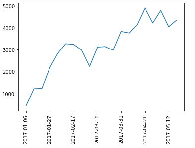
Posted by Mark on May 13, 2022 at 07:24 | Last modified: March 22, 2022 10:27Last time, I resolved a couple complications with regard to the x-axis. Today I want to tackle the issue of plotting a marker at select points only as shown in the first graph here.
Here is a complete account of what I have in that graph:
- Cumulative PnL on the y-axis that is available every week
- Datetime x-axis
- Markers on the line plot on where new trades begin
I cobbled together some solutions from the internet in order to make this work. I finally realized it’s not about plotting the line and then figuring out how to erase certain markers or plotting just the markers and figuring out how to connect them with a line. Rather, I must plot the line without markers first, and then plot all points (with marker or null) on the same set of axes:
> axs[0].plot(btstats[‘Date’],btstats[‘Cum.PnL’],marker=’ ‘,color=’black’,linestyle=’solid’) #plots line only
> for xp, yp, m in zip(btstats[‘Date’].tolist(), btstats[‘Cum.PnL’].tolist(), marker_list):
> axs[0].plot(xp,yp,m,color=’orange’,markersize=12) #plots markers only (or lack thereof)
This took days for me to figure out and required a paradigm shift in the process.
Does it really needs to be that complicated? I am going to re-create the graph with a simpler example in order to find out.
Here’s a rough list of objectives for coming up with data to plot:
- Generate a list 2017_Fri 20 consecutive Fridays starting Jan 1, 2017.
- Generate random_pnl_list of 20 simulated trade results from -1000 to +1000.
- Generate cumul_pnl_from_random, which will be a list of cumulative PnL based on random_list.
- Randomly determine trade_entries: five Fridays from _2017_Fri.
- Plot cumul_pnl line.
- Plot markers at trade_entries.
This accomplishes objective #1:
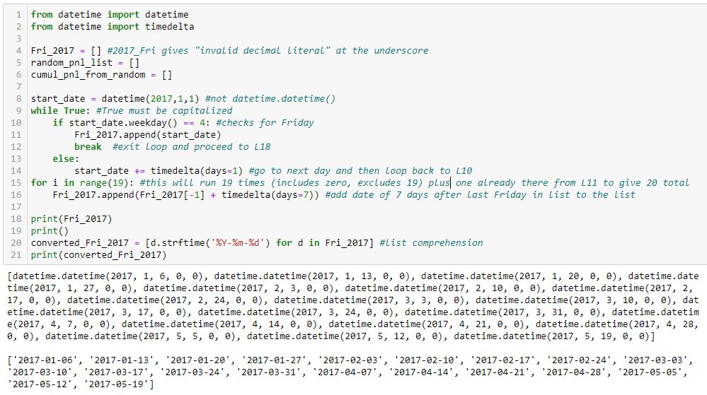
I tried to comment extensively in order to explain how this works.
Two lists of dates are shown in the output at the bottom. The first list is type datetime.datetime, which is a mess. The second list is cleaned up (type string) with L20.
I will continue next time.
Categories: Python | Comments (0) | PermalinkDebugging Matplotlib (Part 3)
Posted by Mark on May 10, 2022 at 07:07 | Last modified: March 16, 2022 14:44Today I resume trying to fix the x-values and x-axis labels from the bottom graph shown here.
As suggested, I need to create a list of x-values. Even better than a loop with .append() is this direct route:
> randomlist_x = list(range(1, len(randomlist + 1))
This creates a range object beginning with 1 and ending with the length of randomlist + 1 to correct for zero-indexing. The list constructor converts that to a list. Now, I can redo the graph:
> fig, ax = plt.subplots(1)
>
> ax.plot(randomlist_x, randomlist, marker=’.’, color=’b’) #plot, not plt
> plt.show()
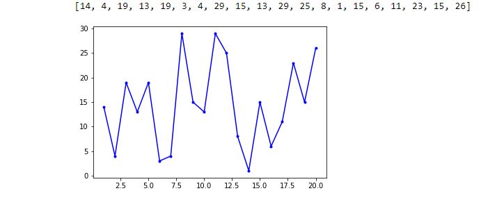
The one thing I can see is decimals in the x-axis labels, which is not acceptable. Beyond that, I don’t have much clarity on the graph so I will add the following to show grid lines:
> plt.grid()
I can now clearly see the middle highlighted dot has an x-value of 5. Counting up to x = 10 for the right highlighted dot, I have confirmation that each dot has an x-increment of 1. The highlighted dot on the left is therefore at x = 1. I have therefore accomplished my first goal from the third-to-last paragraph of Part 2.
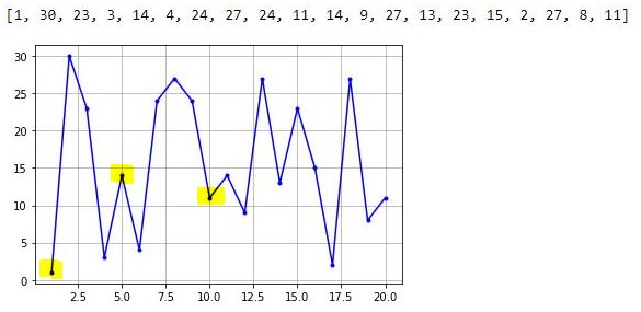
To get rid of the decimal x-axis labels, I need to set the major tick increment. This may be done by importing this object and module and following later with the lines:
> from matplotlib.ticker import MultipleLocator
> .
> .
> .
> ax.xaxis.set_major_locator(MultipleLocator(5))
> ax.xaxis.set_minor_locator(MultipleLocator(1))
The major and minor tick increments are now 5 and 1, respectively, and the decimal values are gone.
Thus far, the existing code is:
> from matplotlib.ticker import MultipleLocator
> import matplotlib.pyplot as plt
> import numpy as np
> import pandas as pd
> import random
>
> randomlist = []
> for i in range(20):
> n = random.randint(1,30)
> randomlist.append(n)
> print(randomlist)
>
> randomlist_x = list(range(1, len(randomlist)+1))
> fig, ax = plt.subplots(1)
>
> ax.plot(randomlist_x, randomlist, marker=’.’, color=’b’) #plot, not plt
> ax.xaxis.set_major_locator(MultipleLocator(5))
> ax.xaxis.set_minor_locator(MultipleLocator(1))
>
> plt.grid()
> plt.show()
I will continue next time.
Categories: Python | Comments (0) | Permalink