Rolling Naked Puts (Part 2)
Posted by Mark on June 9, 2017 at 07:18 | Last modified: February 21, 2017 10:21Last time I presented some data in an attempt to replicate the Market Measures (MM) episode from November 8, 2016.
The backtesting methodologies are different. MM started with 0.30-delta naked puts. They took assignment at expiration and sold a 0.30-delta call against it. I started with 0.20-delta naked puts and whenever a 3x stop-loss was hit, I rolled out to the next available expiration month.
My reason for rejecting the roll adjustment had to do with the larger max drawdown (DD) and standard deviation (SD) of returns. MM did not present these statistics.
The Tasty Trade mantra “trade small and trade often” alleviates the DD/SD concern. This is an effective means to cover their *ss because no one loss would ever be catastrophic. I feel this works for people trading part-time as a hobby who have an independent paycheck consistently coming in.
I do not believe “trade small and trade often” works for people trading full-time as a business, however. Unless capitalized with millions of dollars, one cannot trade “small” and still be able to cover living expenses. When position sized as a viable business, most traders do not have enough diversified strategies to avoid widespread portfolio devastation should a naked put max DD type of event occur. This is why I believe max DD and SD of returns are necessary to design a workable trading plan.
My backtest included 509 trades that hit a 3x stop-loss but excluded an additional 376 trades that hit the 2x stop-loss level. Naked puts that lose on the roll are those where the market does not recover or continues to tank lower. These are the most severe losses and are included in the present backtest. Backtesting trades hitting the 2x stop-loss that do not go on to hit 3x would therefore probably improve overall results.
I do not believe inclusion of the 2x stop-loss trades would be enough to save the rolling strategy, however. While I would expect to see more than a 15% improvement, even if PnL improves by up to 50% (for example), the 4x larger max DD realized when rolling would necessitate a decrease in position size by 80% to equate the DD’s and 80% >> 50%.
Categories: Backtesting | Comments (0) | PermalinkRolling Naked Puts (Part 1)
Posted by Mark on June 6, 2017 at 06:48 | Last modified: February 20, 2017 09:42The motivation for this study comes from the Market Measures (MM) episode discussed here. Is rolling naked put losers a viable strategy for improving trade results?
Here are some important details from my study:
- All trading was done at 3:30 PM
- Used first strike with delta < 0.20
- Rolled put to next available expiration when 3x stop-loss hit
- Closed puts on expiration Thursday
- All trades subject to a $0.26/contract transaction fee
Here’s what I found:
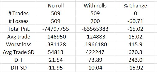
Out of 509 trades, only 200 lose on the roll. This represents a 60% reduction in number of losers as shown in the third column. Rolling reduces net loss by about 15% and the average trade improves on the roll by the same amount (rows 4-5). That is the good news.
Bad news starts with row 6: the worst loss increases by over 400% with rolling. The standard deviation (SD) of trade results also increases over 650%. I have discussed many times how maximum drawdown (DD) and SD both represent risk (e.g. here, here, and here). If I position size based on max DD then I would have to trade five times smaller with rolling than without. A 15% improvement in PnL is hardly going to compensate for that.
Days in trade (DIT) is obviously larger with the roll. It more than triples, though, and this will dilute the PnL improvement. Three non-rolling trades could be done in the roughly 74 days it would take for one rolling trade. With a win rate over 84%, odds are the sum of three trades will better the PnL of the rolled trade.
Looking back to the MM presentation, the biggest difference between my analysis and theirs is what they did not present. I have detailed this critique elsewhere. Like the MM episode, I looked at success rate, average PnL, and DIT. I also discussed max DD and SD of results, though, where MM did not. As it turns out, these are the statistics I find to be most decisive and they are the biggest reason I believe rolling is not viable. MM arrived at the opposite conclusion.
I don’t believe the full picture of rolling can be understood without analysis of max DD and PnL SD. Without them you may be headed for an awful surprise when max rolling DD is experienced with real money! That would not make for a pleasant day.
I will continue next time.
Categories: Backtesting | Comments (1) | PermalinkMaximum Excursion Study
Posted by Mark on May 12, 2017 at 06:45 | Last modified: February 9, 2017 10:23I previously did a study on maximum adverse excursion. Today I will discuss another study I did on maximum excursion (ME) in November 2015.
Excursions can be favorable or adverse. Maximum adverse (favorable) excursion is the largest loss (gain) during the lifetime of a trade. This is abbreviated MAE (MFE).
Although I selected a period of 23 trading days for this study, I should repeat the study over different periods to make sure the results are stable and not fluke. A period of 23 trading days corresponds to roughly one calendar month.
I used index prices for this study and looked at the MAE (downward price moves) and MFE (upward price moves) over the next 23 trading days. The study covered 3,681 data points from Jan 1, 2001, through Oct 29, 2015.
I stratified results by ventiles of a price oscillator (Osc). Osc reflects closing price as a percentage of the 23-day range ending today. Osc may range from 0 to 100. If the index closes today at a 23-day high (low) then today’s Osc reading will be 100 (0). Lower (higher) values of Osc correspond to oversold (overbought) market conditions.
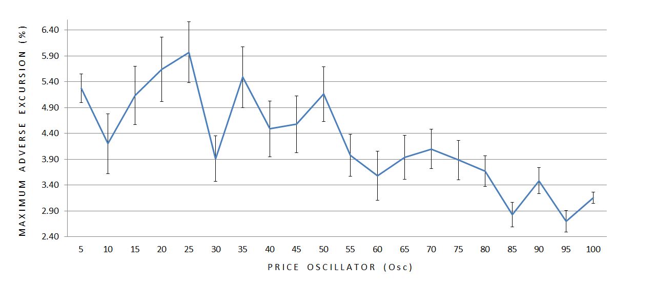
Here are the averages (mean) and standard errors of the mean (SEM) for MAE:
Here are the means and SEM’s for MFE:
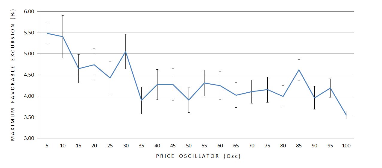
Both ME’s seem to decrease in magnitude as Osc becomes larger.* Furthermore, the variability (SEM) of the data seems to decrease as Osc increases with the exception of the first bar. Sample size is used to calculate SEM so I graphed it:
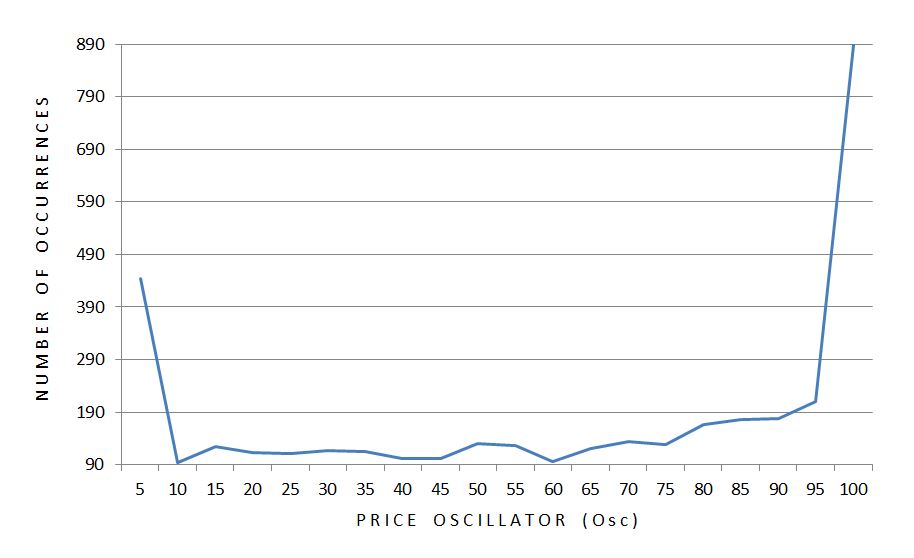
A disproportionate number of occurrences take place at the extremes. Furthermore, twice as many occurrences take place at the high as the low. Sample size could therefore explain why the smallest error bar is seen at the right edge of the graph.
Standard deviation (SD) is a measure of variability that does not correct for sample size. Here is a graph of SD across all 20 ventiles of Osc:
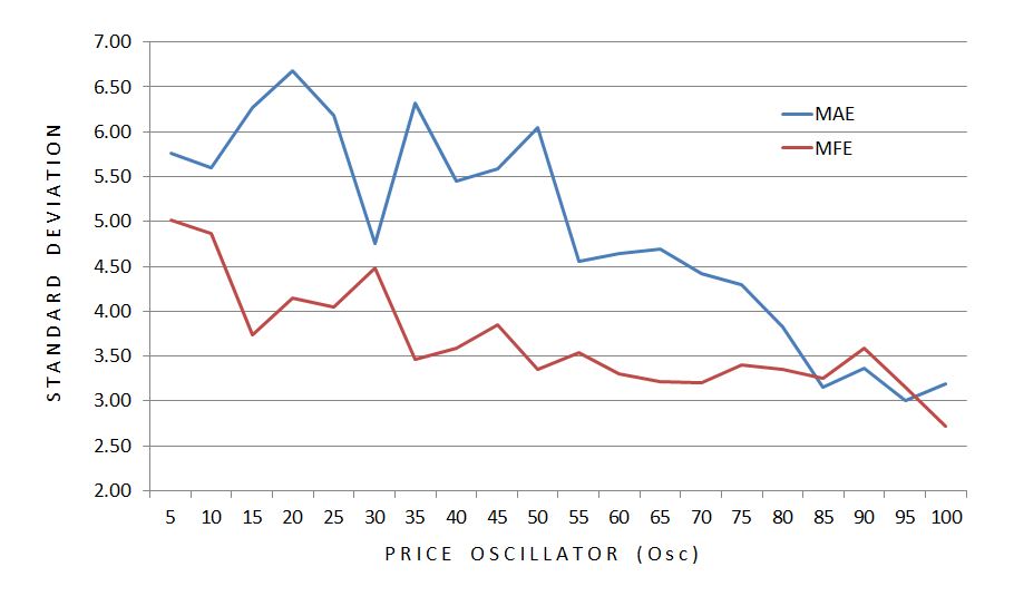
SD makes the case for an inversely proportional relationship between variability and Osc.
The smaller magnitudes of excursion as the market becomes more overbought corroborates the variability finding. Together these paint a picture of greater stability in bull markets.
This is not about trend-following vs. mean-reversion behavior. When the market is down, the larger up moves (MFE) suggest mean reversion but the larger down moves (MAE) suggest trending behavior. When the market is up, the smaller up moves suggest mean reversion but the smaller down moves suggest trending behavior. These are contradictory.
The findings make more sense from a volatility perspective. Implied volatility generally increases as the market sells off. This means larger moves are expected in either direction, which is just what we see.
* –For those interested, a single-factor ANOVA was highly significant for both MAE and MFE (p < 0.0001).
Categories: Backtesting | Comments (0) | PermalinkDynamic Iron Butterflies (Part 6)
Posted by Mark on April 4, 2017 at 06:42 | Last modified: May 26, 2017 12:53In the spirit of “who ever said making a business out of trading should be easy,” today I will present results on a 50% stop-loss (SL) applied to the dynamic iron butterfly (DIBF).
Backtesting this was actually not too difficult. Once I got started, it did not take much time to redo 526 backtrades. I did have to verify the cost of each trade because over the first few years of the data series, OptionVue had a lot of missing data (filling in with theoretical values is variable because it does so according to what data is in computer memory at that given moment). Thanks, as always, to Ken Dole for expert technical support when needed.
Here are some observations from redoing 526 backtrades:
–Nine trades came up winners
–Upon third check, only four of nine were winners
–Multiple trades would have been setup differently upon replication
These observations are due mostly to the inconsistencies described above. I did not change any backtrade results but I did remove four backtrades because the 50% SL was not triggered upon replication.
Here are some trade statistics with and without the SL:
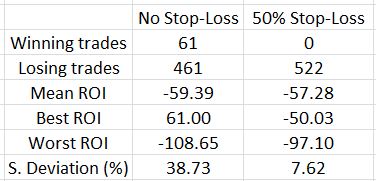
The 50% SL marginally improves results on average as the mean ROI improved 2.11% (all ROI’s are percentages).
Looking at the best and worst trades is an indication of how the range contracted with the SL. This is strongly affirmed by the standard deviation (SD), though, which becomes much smaller. Once again, SD is a measure of risk so this is meaningful.
How does this impact the overall backtest?
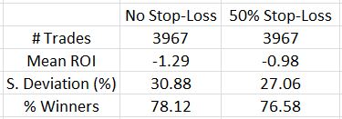
The SL improved the average trade by 0.31% and decreased the SD by over 10%. That’s definitely a win-win despite a lower number of losing trades.
One further thought I had about limiting losses was that the upside on an asymmetrical butterfly already has limited loss. If the SL is not implemented on the upside, trades that would otherwise go on to be winners would not be stopped out for losses. As it turned out, only eight of 61 trades that went on to hit the 10% profit target or went on to be profitable at expiration after being stopped out were hurt on the upside. Four of those butterflies were balanced, though. Not implementing the SL on market moves to the upside where the DIBF was asymmetrical only improved mean ROI by 0.5%. It also increased SD to 9.60%.
Although it did not improve trade statistics much (or at all), I think it makes sense to not implement an upside SL on an asymmetrical DIBF.
Categories: Backtesting | Comments (0) | PermalinkDynamic Iron Butterflies (Part 5)
Posted by Mark on February 16, 2017 at 07:28 | Last modified: February 2, 2017 09:40Better execution can definitely improve profitability of the dynamic iron butterfly (DIBF). This makes me wonder about placing the trade and just leaving it to sit until filled.
Analysis of the maximum adverse excursion (MAE) can help to study this. A losing trade could almost always have been filled at a better price. Out of 3968 backtrades, 736 never get down more money than they are at trade inception. Minute-to-minute volatility in the markets is much greater than day-to-day (seen in my EOD backtest) volatility, which provides hope that most of the 736 would eventually fill. This is no guarantee, however, and 18% includes a big opportunity for otherwise winning trades to go unfilled thereby depressing total return.
Here is the complete MAE distribution across 3,968 backtrades:
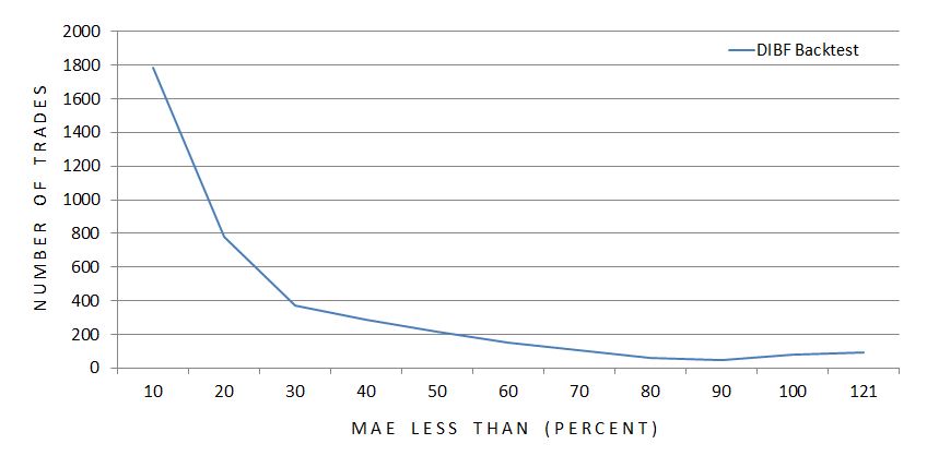
The x-axis indicates the maximum MAE seen for each particular grouping of trades. The first data point includes all trades with MAE less than 10%, the second data point includes all trades with MAE of 10% up to 20%, etc.
The graph illustrates a majority of trades never get down a whole lot.
Here’s the same information packaged somewhat differently:
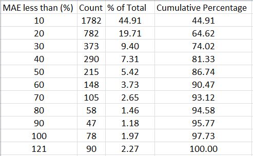
With a profit target of 10%, over 64% of all backtrades never get down more than 20% and over 86% never get down more than 50%.
This suggests a potential benefit to using a stop-loss. I still need to better understand how many winners would be affected, though. How does the MAE distribution compare between winning and losing trades?
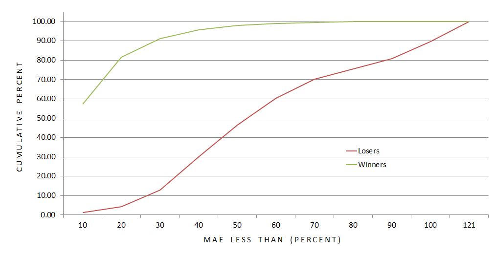
This graph shows the difference to be significant. Over 91% of winners never get down more than 30% compared to just under 13% of losers. The average MAE for winning (losing) trades is 12.9% (57.9%).
Over 98% of winning trades are never down more than 50%.
Is a 50% stop-loss worthwhile?
The cost is conversion of 59 winning trades into certain losers ranging anywhere from 50-90%.
The benefit is an opportunity to save money on 467 trades that would otherwise lose up to ~100%.
This sounds like a reasonable trade-off to me since the number of trades potentially benefitting is eight times the number to suffer a worse fate. And even if the overall return does not improve, cutting down the biggest losers would still reduce the standard deviation of returns, which is a measure of risk.
Confirming this would involve collecting revised loss data on 526 backtrades with MAE over 50%. I should also backtest the surrounding parameter space by checking stop-loss thresholds like 10%, 20%, etc. This could be an awful lot of work…
But who ever said making a business out of trading should ever be easy?
Categories: Backtesting | Comments (1) | PermalinkDynamic Iron Butterflies (Part 4)
Posted by Mark on February 13, 2017 at 06:56 | Last modified: January 6, 2017 10:24My last post was a hodgepodge of information about the dynamic iron butterfly (DIBF) backtest and I’m going to pick up right where I left off.
The differential loss data compounds my concern about the backtest being a combination of two different trades. As a combination, it’s hard to tell to what extent the “dynamic” [put credit spread (PCS)] aspect contributes to the profitability. Worrisome is the fact that 77% of the losses are to the downside: exactly where the “dynamic” aspect can result in greater loss. Let’s take a closer look at the loss distribution:
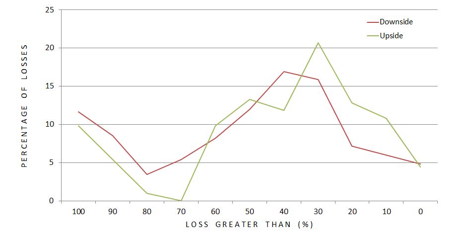
Each data point represents what percentage of upside (green) or downside (red) losses occurred at different magnitudes of loss (ROI %). The difference does not look as dramatic as I expected but it still may be. A greater percentage of downside losses occurred at loss levels exceeding 70% ROI. Furthermore, 66% (51%) of downside (upside) losses were worse than 40%. This is a rather large difference especially considering the fact that 77% of all losses were to the downside.
Plotting number of losses, rather than percentage, looks like this:
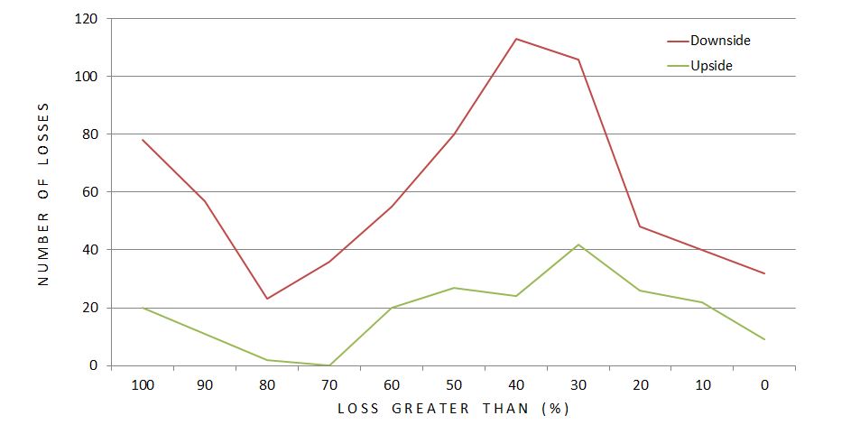
The difference looks more dramatic here. Total dollars lost would mimic this.
While the PCS is an obvious culprit when studying directional loss distribution, we cannot forget that it benefits the position to the upside. More than just “upside,” the PCS benefits the position as long as the market does not fall more from the DIBF short strike than the width of the call credit spread. This is the “dynamic” portion. I don’t need to do the computations to know this is the vast majority of winners. In fact, this will always be the case:
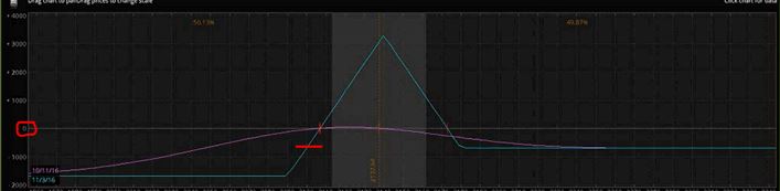
If the market falls an amount equal to the width of the call credit spread, this trade will be losing money as evidenced by the intersection of the red horizontal hashmark and blue line being below zero profit (circled in red on the y-axis). That would be my reason for hypothesizing all winners will have fallen less than this amount even though before expiration, unrealized loss is not as extreme (e.g. purple curve).
In any case, what would be interesting to know is how DIBF performance compares to a symmetrical iron butterfly (no PCS). This is definitely a future direction for study.
Next on the docket, though, is analysis of maximum adverse excursion.
Categories: Backtesting | Comments (0) | PermalinkDynamic Iron Butterflies (Part 3)
Posted by Mark on February 10, 2017 at 06:58 | Last modified: December 7, 2016 15:25In the last post I suggested overstatement of transaction fees may have been the difference between a winning and losing dynamic iron butterfly (DIBF) backtest.
I crunched the numbers and can now speak definitively to that hypothesis. Here are the overall backtested trade statistics recomputed for different transaction fees (TF). The second column is the $0.26/option used in the original backtest:
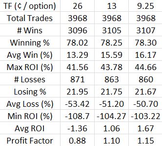
Indeed, lowering the transaction fees does make this a profitable trade. While the profit factor of 1.15 is not nearly as impressive as the 1.58 seen for naked puts, it is at least profitable.
Put another way, these numbers provide reasonable doubt as to whether the DIBF is actually a losing trade. My preference is still to bias slippage in favor of loss and regardless of the heavy slippage applied, I want to see if I can do anything to boost the average trade and make this strategy more encouraging.
Doing the backtest helped me discover two potential problems.
First, the DIBF has a varied reward-to-risk ratio (RRR). I noticed at times the RRR was downright rotten (less than 1.0). This could be improved by decreasing the width of the put wing. I suspect a lower RRR might lead to a lower winning percentage and a longer time in the trade because the T+0 curve is particularly steep to the downside in relation to the limited potential profit at expiration. RRR was not tracked in the current backtest so my suspicion remains speculative.
My second issue with the strategy is the fact that it is a combination (of an iron butterfly and put credit spread). Selling an OTM long put and buying one further OTM—a credit spread—is what makes it “dynamic.” Before delving too much into the results of a combination strategy, I feel inclined to first study a plain iron butterfly. I may or may not do that before having the confidence to trade the DITM regularly.
Thanks to Pete_UK for helping me calculate the directional breakdown of losses in a hurry:
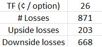
This compounds my concern about adding a put credit spread to the iron butterfly.
Categories: Backtesting | Comments (3) | PermalinkDynamic Iron Butterflies (Part 2)
Posted by Mark on February 7, 2017 at 06:57 | Last modified: December 6, 2016 11:14Last time, I presented the overall trade statistics for my first study of dynamic iron butterflies (DIBF). The results were not pretty. Today I want to address the impact of transaction fees (slippage + commission).
I have previously discussed how transaction fees can make or break a study. I subtracted $0.26/contract because I was backtesting some expensive, at-the-money options and when I have to estimate, I prefer to bias in favor of loss. Despite only trading a handful of live butterflies to date, I have never paid more than $0.13/contract in transaction fees (sometimes $0.06). Fast-moving markets could take more than $0.26 but such adverse conditions are rare.
Let’s compute how an overestimation of transaction fees may have affected results. The mean margin requirement (MR) across all trades was $4,878. I subtracted $26 * 8 = $208 from each trade for transaction fees. Cutting that by 50% adds $104 / $4,878 * 100% = 2.1% ROI to each trade. The average trade lost 1.4% so this modification makes the backtested DIBF a winning trade (+0.7%). If even 50% is estimating high then I should reduce transaction fees between $104 – $156. If I use the middle of that range then the average trade gains 1.2%.
Transaction fees alone can make the difference between a 1.4% loss and a 1.2% profit per trade. Financially speaking, those are worlds apart. Thinking about how many traders omit transaction fees entirely for the sake of simplicity just boggles my mind. No wonder so many statistics suggest up to 90% of traders fail within the first five years.
These calculations are based on averages but the exact MR should be considered. Reducing slippage by $52 impacts a $2600 trade twice as much as a $5200 trade. More expensive trades occur in higher IV, which occurs less frequently. I would therefore hypothesize lower MR trades to dominate the distribution, which might boost average ROI further:
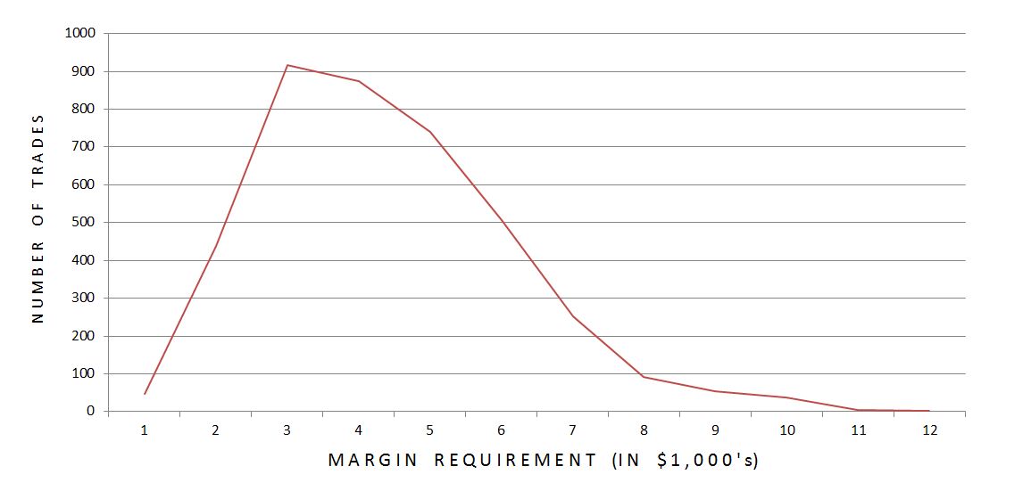
Indeed, 88.8% of trades had MR within the lower half of the range. While cheaper trades significantly outnumbered expensive ones, only 54.8% of trades had MR below the arithmetic mean. The impact of this skewed distribution is questionable.
Having a more significant impact would be trades where the long option(s) would have been left to expire worthless in live trading. These seemed to occur later in the data series at higher prices for the underlying. Being forced to allow one or two long options to expire worthless saves approximately $20 or $40 per trade, respectively.
I will continue the discussion in my next post.
Categories: Backtesting | Comments (1) | PermalinkDynamic Iron Butterflies (Part 1)
Posted by Mark on February 2, 2017 at 07:13 | Last modified: December 2, 2016 14:50I want to trade butterflies and the only way I can get myself to trade something new is to backtest it. This study is based on a Tasty Trade segment from April 1, 2016.
The subject of this analysis is dynamic iron butterflies (DIBF). Without further ado, let’s jump ahead to the results:
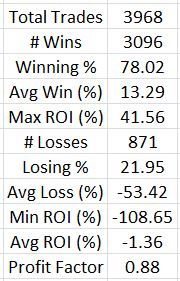
This is a completely different profile than that presented in the Tasty Trade video! Make no mistake: with an average loss posted after 3,900 trades, this is ugly.
These negative results were very surprising to me. I have been conditioned to be a believer in short strangles (the butterfly’s undefined-risk counterpart) and I have personally done some backtesting to support that belief.
Before throwing the proverbial baby out with the bathwater, let’s step back and critique the methodology.
My first thought is that I was probably heavy on the transaction fees. $26/contract might be reasonable during fast-moving markets but is probably excessive in most cases.
Second, instead of expiring DOTM longs in the later years of backtesting, I sold them for the nickel (or less) they were stated to be worth. In reality, I probably would not have been able to sell them so close to expiration and I would have been spared that $26/contract. Proceeding in this fashion saved time (it took me four months to do this study) and I am typically comfortable with backtesting bias that favors the losing side.
My third question mark surrounds asymmetrical loss, which may or may not be an issue. I calculated profit/loss in terms of ROI(%) because the margin for a 1-contract trade ranged from $1,401 to $12,400. With ROI(%) itself serving as normalization, I discovered the discrepancy. In some cases the market moved far against the trade to the downside causing > 100% loss (transaction fees). In other cases the market moved far to the upside causing a more limited loss (e.g. 50 – 90%). Some trades also ended up symmetrical: maybe these should be separated out?
The average loss was just over four times the average win, which completely nullifies the benefit of 78% winners. That suggests an MAE analysis to see if stops could be beneficial.
Categories: Backtesting | Comments (2) | PermalinkNaked Put Study 2 (Part 9)
Posted by Mark on January 10, 2017 at 07:24 | Last modified: October 21, 2016 12:56Today I will tie up a couple loose ends regarding NP Study 2.
First I present overall trade statistics stratified by stop level:
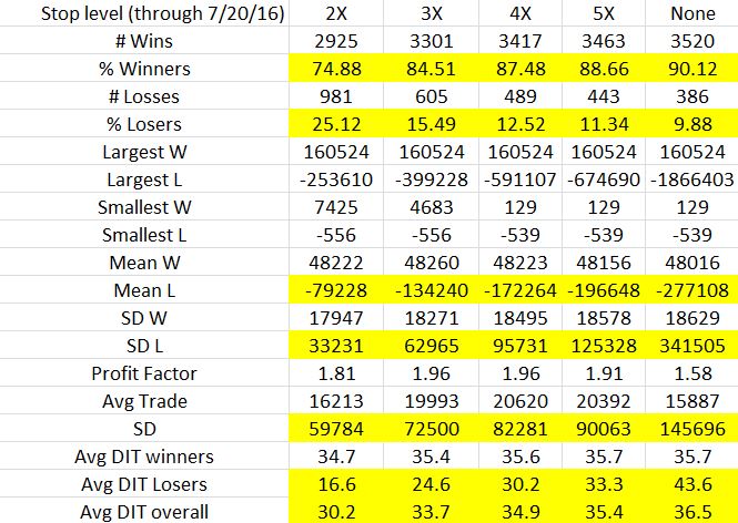
Cells that show trends from low (tight) to high (loose) stop level are highlighted:
- The looser (tighter) the stop, the higher the winning (losing) percentage
- The looser the stop, the higher the average loss and standard deviation of losses (more extreme outliers)
- The looser the stop, the higher the overall standard deviation of trades (more extreme outliers)
- The looser the stop, the longer the average losing trade and overall trade (stops shorten what would otherwise be trades taken to expiration)
Average trade and profit factor both peak at the 4X stop level. I find this interesting because net return / maximum drawdown (MDD) peaks at the 2X stop level. To me, that was a pretty compelling case to use 2X.
Which statistics are more meaningful in this comparison brings us to the second loose end: my previous mention about Monte Carlo simulation. The trade statistics shown in the table above are based on 3,906 trades. The MDD is based on just one possible selection of trades. If I stick with the percentages and run multiple simulations with replacement then I can take averages of the MDD and other portfolio parameters. I think this would be very insightful.
I go back and forth as to whether the Monte Carlo simulation should be done with or without replacement. To give me the most confidence in trading the system, I want to select the method that is more likely to underestimate returns. In thinking back over the last 15+ years, we have seen some unlikely (multiple standard deviations) market crashes. Simulating with replacement could result in a higher or lower number of extreme losses. Simulating without replacement will result in the same number of losses in random order. This means the MDD will vary depending on the extent to which losing trades become grouped together.
I doubt any blanket answer to this question exists. I should probably do 10,000 simulations each way and see how they compare.
Time to brush up on MS Excel…
Categories: Backtesting | Comments (0) | Permalink