Time Spread Backtesting (Part 1)
Posted by Mark on December 22, 2022 at 06:39 | Last modified: June 13, 2022 14:30Bumps and bruises are still to come along the road ahead, but Version 14d of my backtester is at least somewhat functional. I am now ready to start presenting and interpreting results.
Let’s start with something very basic. In rough terms, SPX_ROD1 time spread strategy is as follows:
- If flat, then open one contract with short leg 2-3 months to expiration and long leg 4-5 weeks farther out in time.
- Exit trade if ROI% > +10% profit target or ROI% < -20% max loss.
Here are the results:
- 257 trades
- 196 winners (~76%)
- Average profit $221
- Average loss $383
- Profit factor of 1.86
In case this seems like a legit backtest, be aware of some things that are missing:
- Trade verification
- Exploration of time stops
- Exploration of alternative exit levels
- Max excursion analysis
- Drawdown analysis
- Position sizing
- Transaction fees
Looking at a summary line in isolation hides a lot of critical information. Things like cost, DIT, width, closing PnL—pretty much anything, really—should be evaluated in relation to surrounding trades to reveal potential errors. I may have coded incorrectly, or I may have a corrupt data file. I have not done my due diligence if I can’t verify by looking through a trade one day at a time to check for reasonable consistency. This isn’t to say I need to look through every trade in every backtest every time, but I should at least do some periodic spot checking.
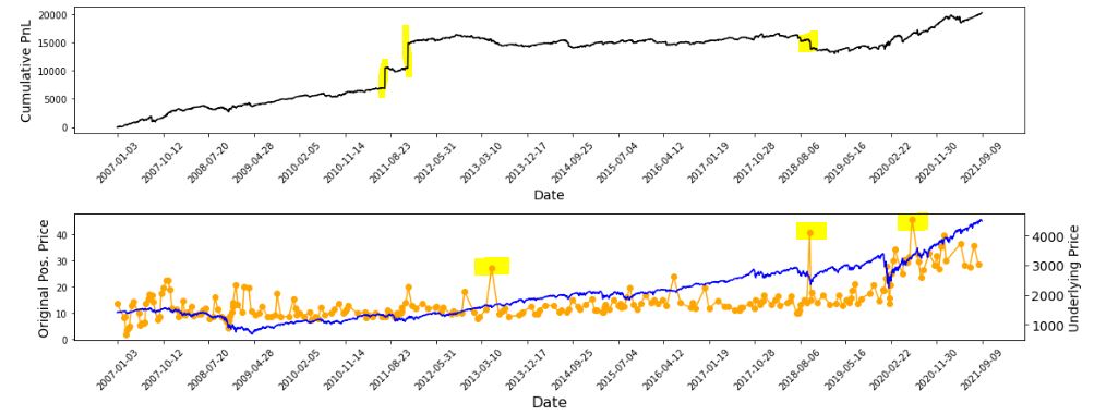
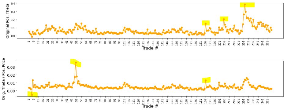
I already have some means to do this spot-check verification. I have two output files with summary and intratrade statistics as well as four graphs [shown below in two separate screenshots] that I spent a lot of time debugging (e.g. this mini-series):
The first graph is an equity curve. Any sudden jumps are things that I want to inspect. I have highlighted three. I remember summer 2011 as a volatile market. I’m not sure about mid-2018. I will take a closer look at the trade log.
The second graph shows trade prices in orange. Any significant spikes are worthy of investigation to make sure nothing more than isolated volatility is responsible for the short-term outlier. I have highlighted three spikes on the graph.
The third graph shows position theta at trade inception. I have highlighted three spikes worthy of a closer look.
The final graph normalizes initial position theta by trade cost. I have highlighted three spikes that are worthy of investigation. The first of these is clearly below zero, which suggests either theta or cost starts out negative. I can hardly imagine either one of those given accurate data so I definitely want to analyze that.
I will continue next time.

