Dissection of an Investment Presentation (Part 3)
Posted by Mark on June 11, 2018 at 06:28 | Last modified: December 25, 2017 10:28Today I continue studying the investment presentation referenced here.
> …important characteristics of the momentum and value factors
> is their negative correlation… meaning value tends to work well
> when momentum is not… and momentum works well when value is
> idle. So each factor adds value on a standalone basis but
> their negative correlation makes them an excellent combination
> for potentially increasing risk-adjusted returns.
“Negative correlation,” which is arguably the “Holy Grail” of diversification, is a great marketing buzz phrase.
One problem is that correlation changes over time. During some of the most severe market declines, negative correlations have turned positive and approached +1.00. This means everything loses. The presentation says from 12/31/1926 – 12/31/2014, correlation of value and momentum was -0.40. This doesn’t tell us how things look at the extremes (when correlation becomes most positive) or what the overall distribution looks like (how often the negative correlation persists). An unstable parameter with large mean excursions coinciding with big losses is probably not a viable trading concept.
At worst, this could completely invalidate momentum and value factors as edge provided by their investing approach.
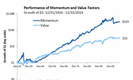
Here is their graph of factor performance:
Over 88 years, $1 grows to $329 and $32 for momentum and value factors, respectively. That sounds impressive!
This is a good time to review my general recommendations for viewing an investment presentation:
- Do not be blinded by the light: their job is to make things look good.
- Accept no comparison without assessing the comparator.
- Challenge everything.
- Do not accept any claims without supporting evidence (added after Part 3).
No available comparator violates #2. We cannot see how the investment performed when not tailored toward momentum or value. A terminal value of $350, for example, would be reason to reject both factors.
Drawdown (DD) analysis is important enough to render any presentation lacking it very limited in application. DDs determine whether we can remain invested in a strategy. I have written about the importance of DDs here, here, here, and here.
With regard to #3, I see the graph omits DD analysis by showing growth of $1. The account would never actually start with $1 and the maximum DD of both curves may even exceed the initial value. Any such equity curve would, in reality, be terminated early due to Ruin (account going to zero).
In other words, growth of $1 to $350 simply would never have happened. The initial account would need to be larger to trade this strategy over the entire 88 years. Adding initial equity dilutes returns. Instead of 35,000%, realistic growth could be 3,500%, 350%, or less. The bloom is off the rose.
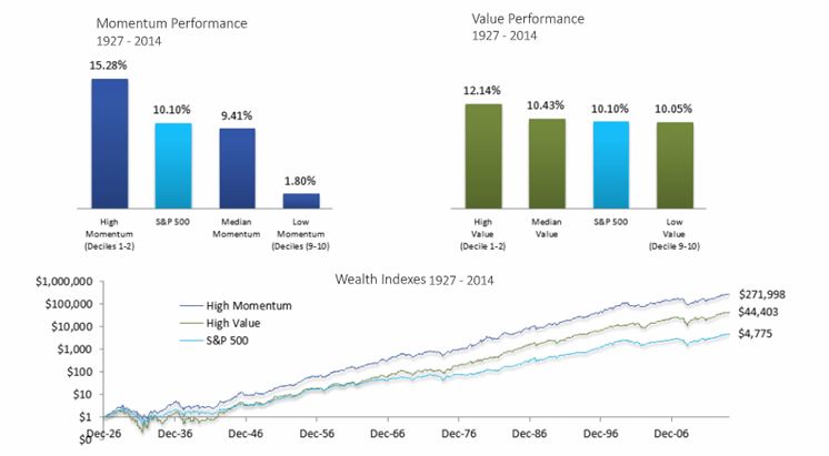
The presentation continues with this slide:
For me, the line graph begs an immediate question: how does this line graph differ from the first one? Both graphs show value and momentum factors. Both show growth of $1. Both cover a similar time interval. Why does momentum in the latter graph only grow to $272 (rather than $329) while value grows to a whopping $44 (rather than $32)? Those are huge differences for a subtraction of one year (or less), which is only a 1.1% difference on 88.
I also wonder why the time intervals are different at all. The first graph is “12/31/1926 – 12/31/2014” and the second is “1927-2014.” Were they just sloppy in reporting the same time interval? If they used the same interval then what/why was the difference in how they defined factors? Did they do their own research or “borrow” data from others?
Consistency breeds credibility and [especially] when consistency is lacking, explanation should be given. None is given here, which violates #4. I question the accuracy of their calculations. I also question their underlying motives. Were they trying to artificially inflate certain numbers to serve their purpose? Remember #1, above.

