RUT Weekly Calendar Trade #1 (Part 2)
Posted by Mark on April 18, 2015 at 05:35 | Last modified: April 17, 2015 14:02I previously gave an overview of my first live weekly time spread. Today I want to run through a few more details.
Compare and contrast:
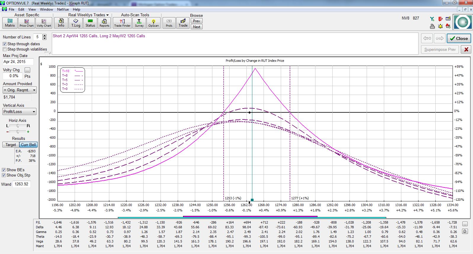
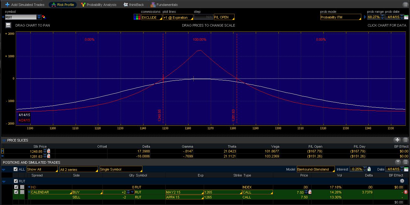
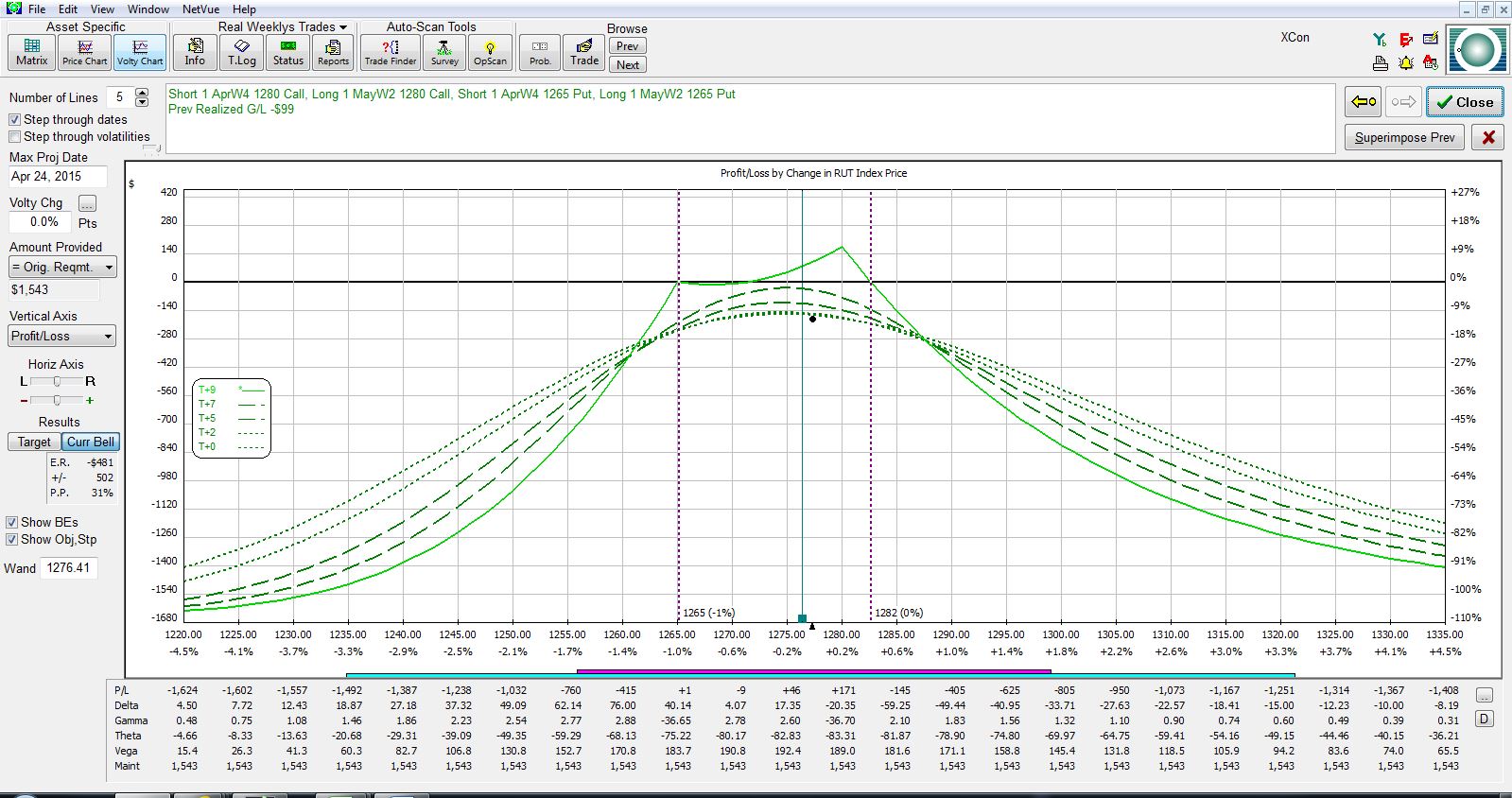
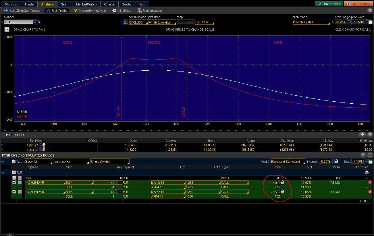
Which pictures portray the correct representation?! Figure 1 has breakevens of 1253/1277 whereas Figure 2 has breakevens of 1249/1281. Figure 3 has breakevens of 1265/1282 whereas Figure 4 has breakevens of 1262/1283. These differing breakevens can significantly affect when to adjust. In addition, the Figure 3 expiration graph is downright ugly! That’s a trade I might not even want to keep. Figure 4? That trade looks to have much more potential.
The only way to truly understand which risk graph is more likely to be accurate is to get a number of these trades under my belt. As the days go by, I’ll be able to see my live P/L and compare that to what the risk graphs tell me. The risk graphs might change over time too and morph into something better aligned with my P/L. Again, only by trading these and learning will I gain the necessary experience to understand.
It’s hard enough to figure this stuff out by trading it live. It might have been foolhardy to ever think I could backtest these with OptionVue, at least, given data in 30-minute increments. Maybe another tool offering finer data (like 5-minute increments) could give me a fighting chance to accurately represent.
I’ll “stick a fork in it” with my next post.


Comments (1)
[…] I will continue and complete the postmortem on my first live weekly time […]