RUT Weekly Calendar Trade #2
Posted by Mark on April 25, 2015 at 13:56 | Last modified: May 14, 2015 10:27On Tuesday morning, April 21, I got filled at 7.25 in about 30 minutes. I caved 0.15 over that time and got filled 0.05 off the the mark. Breakeven points at expiration were 1248 and 1283.
The trade was never challenged. I had a contingent GTC order working to close for 8.09.
I watched the trade all day yesterday. At 3:50 PM, the market was 7.9 / 9.0, which is a mark of 8.45. My order was therefore 36 cents off the midprice and still not filled! I was a bit surprised.
At 3:58 PM, the market was 7.4 / 8.8, which is a mark of 8.1. I figured I surely wouldn’t be filled since my order would need to be at least 20 cents under the midprice if not more than 36 cents to be hit!
Then at 4:02 PM, What do I hear at 4:02 PM, after the regular session had ended: Ding! Ding!
Indeed, my order for 8.09 was filled! The market at that time showed 7.0 / 8.9, which is a mark of 7.95. My order got filled 14 cents better than the midprice! That is a shocker but, of course, I’ll take it any day.
Nothing should surprise me yet since I’m still observing and learning how these things work. This was only my second trade, after all. Once I have a larger sample size of experience then I can look back to determine what is unusual and what is not. Maybe I’ll see a handful of trades executed after the close like this. Who knows?
For this week though, 8.09 – 7.25 minus a few dollars for transaction fees gives me a return of 10.4% in four trading days.
I look forward to the next one!
Categories: Accountability | Comments (0) | PermalinkRUT Weekly Calendar Trade #1 (Part 3)
Posted by Mark on April 19, 2015 at 10:42 | Last modified: April 17, 2015 14:03Today I will continue and complete the postmortem on my first live weekly time spread.
In the last post I illustrated the differences in risk graphs. That’s huge and something I need to eventually figure out.
The final point is retrospective: should I have closed this trade at the first adjustment point? My profit target is 10% with a 15% max loss. In the backtesting I tried to do, if I was anywhere close to max loss at the adjustment point then I wanted to exit the trade. After slippage, I’d likely be at or beyond max loss after adjustment and it can only get [much] worse from there should the market continue moving against me.
The problem here was that I had no idea I was so close to max loss. It came fast (within one day) and the market did not seem to move a great deal to get there! Between OptionVue and my TOS account, I just did not have it modeled acceptably. I probably need to get this into my DDE spreadsheet and then maybe I can create an “after adjustment P/L” cell to project where I would be after 0.10 slippage is applied per leg (for example).
On this trade, I lost 21.2%!
However, in legendary terms, “I’LL BE BAHK” [phonetics mine].
This is why we trade small: to learn the nuances and how the trades work. I think this was a case of whipsaw; the market ran up forcing an adjustment and then ran down even harder. I was going to check before I went out this morning and had I been at the helm, I probably could have saved some of the loss. Market activity like this is just not going to work for this trade, however.
So was this a fluke occurrence or does it happen on a semi-regular basis?
Only time will tell.
Categories: Accountability | Comments (1) | PermalinkRUT Weekly Calendar Trade #1 (Part 2)
Posted by Mark on April 18, 2015 at 05:35 | Last modified: April 17, 2015 14:02I previously gave an overview of my first live weekly time spread. Today I want to run through a few more details.
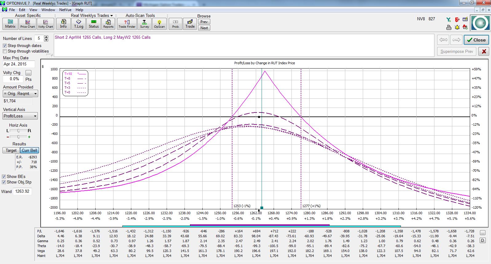
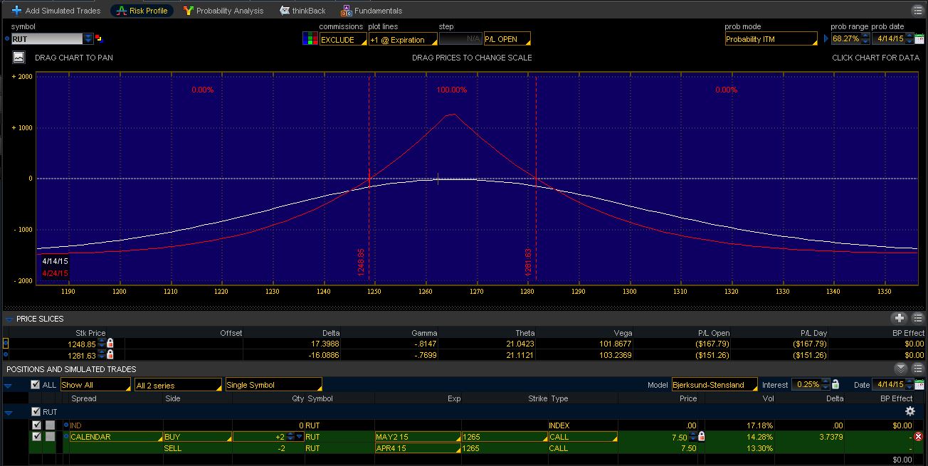
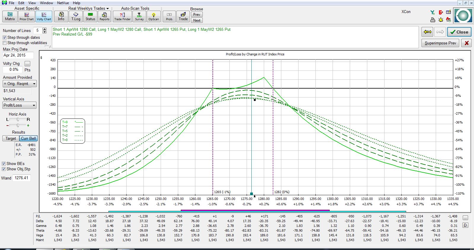
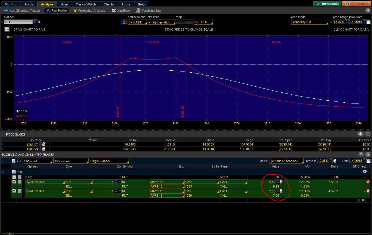
Compare and contrast:
Which pictures portray the correct representation?! Figure 1 has breakevens of 1253/1277 whereas Figure 2 has breakevens of 1249/1281. Figure 3 has breakevens of 1265/1282 whereas Figure 4 has breakevens of 1262/1283. These differing breakevens can significantly affect when to adjust. In addition, the Figure 3 expiration graph is downright ugly! That’s a trade I might not even want to keep. Figure 4? That trade looks to have much more potential.
The only way to truly understand which risk graph is more likely to be accurate is to get a number of these trades under my belt. As the days go by, I’ll be able to see my live P/L and compare that to what the risk graphs tell me. The risk graphs might change over time too and morph into something better aligned with my P/L. Again, only by trading these and learning will I gain the necessary experience to understand.
It’s hard enough to figure this stuff out by trading it live. It might have been foolhardy to ever think I could backtest these with OptionVue, at least, given data in 30-minute increments. Maybe another tool offering finer data (like 5-minute increments) could give me a fighting chance to accurately represent.
I’ll “stick a fork in it” with my next post.
Categories: Accountability | Comments (1) | PermalinkRUT Weekly Calendar Trade #1 (Part 1)
Posted by Mark on April 17, 2015 at 12:45 | Last modified: April 17, 2015 12:45This is the week I decided to junk the backtesting and try a real one live!
On Tuesday, RUT opened down on the day. I entered an order to buy 2 @ 7.40, which would have been around the mark or a little better. RUT rallied to 1265 and I did not get filled over the next few hours.
I canceled that order and did get filled on a 1265 spread for 8.14. The order was placed at the midprice and sat for two hours before I caved 0.10 and got filled about nine cents off the mark.
The market rallied on Wednesday and around midday, I rolled one of the 1265 spreads to 1280. I did this for six cents but I was down nearly 15% on the trade when it was done. I caved about 0.20 off the midprice to do this: one dime off each spread.
Today, the market tanked out of the gate. I ran some errands and came back 30 minutes into the session to see the market around 1256. I entered an order to close the DC at the midprice around 10:01. The market fell over one point in a minute and I ended up caving 0.95 over two minutes. I got filled 0.08 off the then mark, which ended up being 0.43 off my original limit price and 0.52 better than the modified order I had submitted to close. My total loss on the trade was an ugly 21.2%.
Think about that slippage for a moment: 0.43! I suppose that’s not horrible. That is roughly 0.11 per leg, which is usually the worst I would include in backtesting. The long options here were pretty expensive too and those spreads are pretty wide. One of my short options was 1.50/2.50. That seems a bit absurd. In fast-moving markets those spreads will widen and I guess given that, it’s not horrible to lose only this much in slippage.
I’ll cover a few more details about this trade in my next post.
Categories: Accountability | Comments (2) | PermalinkCorrelation Confound (Part 3)
Posted by Mark on April 3, 2015 at 06:41 | Last modified: May 17, 2015 08:35Correlation confound #1 dealt with portfolio diversification. Today I will discuss correlation confound #2, which has to do with pairs trading.
To design a pairs trade, the first step is said to be finding stocks that are highly correlated. This could involve businesses in the same industry or sub-sector, index ETFs like QQQ and SPY, highly-correlated futures pairs, etc.
The next step is to monitor a chart showing price ratio between the two markets. When the price ratio diverges far enough, I want to go long (e.g. sell an OTM put spread) the relatively cheap market and go short (e.g. sell an OTM call spread) the relatively expensive market. Since the two markets generally move together (i.e. highly correlated), when they move apart I should expect mean reversion where they come together again.
Correlation confound #1 also applies to pairs trading. Just because markets have been correlated in the past does not mean they will be correlated in the future. That could cause problems for pairs trades.
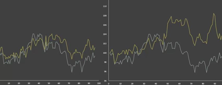
Correlation confound #2 is something called cointegration. Correlation measures the tendency of two variables to move together but it’s not guaranteed that they’ll stay close to each other. Look at the following charts of the gold and silver markets:
Believe it or not, in both charts these markets have the same statistical correlation of +0.75! If you took on a traditional pairs trade when these markets were far apart with the expectation that they would get closer together, you might be sorely disappointed with the graph on the right but happy with the graph on the left.
Cointegration is a measure of how well assets are tied together. Two correlated variables are allowed to wander arbitrarily far apart but a cointegrated variable is not. Cointegrated variables are expected to stay parallel to one another since the difference between the two will be corrected over time.
Categories: Option Trading | Comments (0) | Permalink